REN Skincare
UX/UI Case Study
UX/UI Case Study
UX/UI Case Study
The Brief
I was tasked to redesign the Ren Skincare website so that it better reflected the aesthetic of the brand. This project demonstrated how the power of strong branding and website design can drive business growth and establish a lasting impression on customers.
I was tasked to redesign the Ren Skincare website so that it better reflected the aesthetics of the brand. This project demonstrated how the power of strong branding and website design can drive business growth and establish a lasting impression on customers.
Client
Client
Ren Skincare
Duration
Duration
2 Weeks
Role
Role
UX Researcher & UI Designer
Year
Year
2022
The Brief
I was tasked to redesign the Ren Skincare website so that it better reflected the aesthetic of the brand. This project demonstrated how the power of strong branding and website design can drive business growth and establish a lasting impression on customers.
Client
Duration
Ren Skincare
2 Weeks
Role
UX & UI Designer
Year
2022

The growth of convenient shopping
The e-commerce sector has revolutionized the purchasing, browsing, and transaction processes. It has altered the way customers engage with a brand and invest their time and effort in becoming a part of that brand's narrative. The ongoing expansion of convenience shopping, along with COVID-19, has led to a significant reduction in physical retail stores. As COVID-19 has redefined the way the world operates, companies turned to their online presence to develop a new or enhanced customer experience.

But who are
REN Skincare?

REN Skincare is a conscientious skincare company, known for its
eco-friendly and pure products. This brand provides exceptional skincare items without compromising on environmental concerns. REN Skincare's style is minimalistic and refined, and the website's user experience should embody this elegance.
The Problem
For a high end brand, their website focused more on sales. A lot of their consumers rely on buying from other third party sites instead of their own brand website.
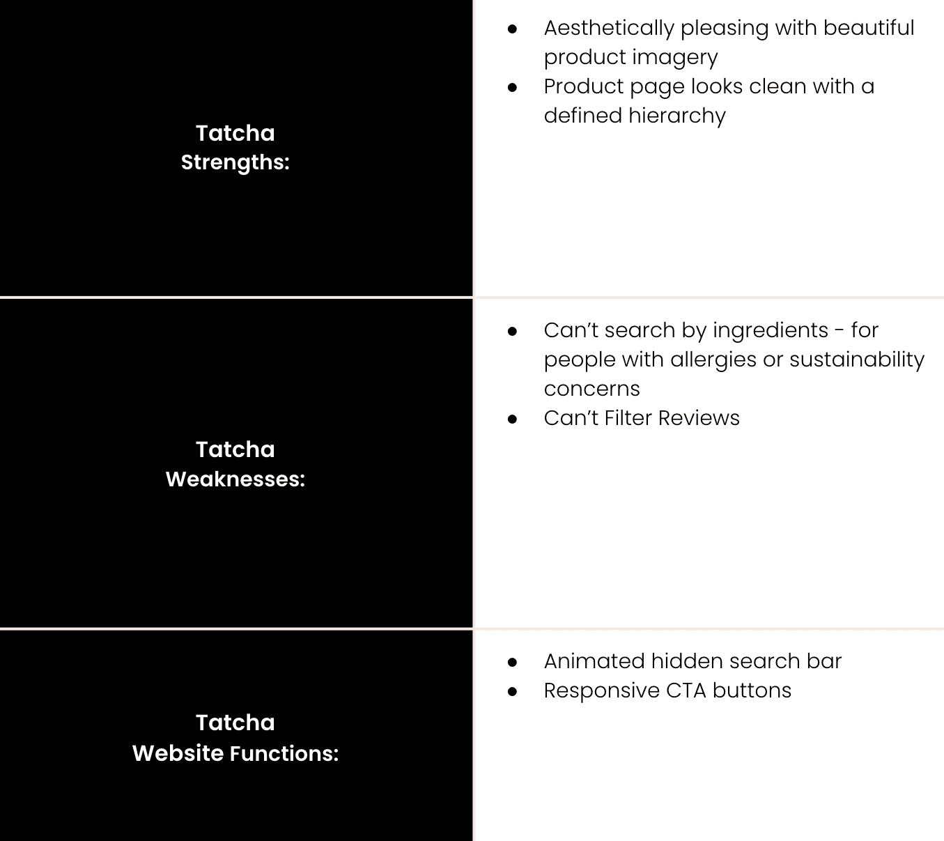
Competitor Analysis
I carried out a competitor analysis
for desktop and mobile sites of direct competitors (Biossance & Tatcha),
to help inform my UX design process.
The competitor analysis provided insights into the strengths and weaknesses of competitor sites, and which features could be added to the Ren Skincare site to put it in a fair position to compete with competitor brands whilst appealing to the same target market.
Key Findings:
The analysis identified a number
of similarities across the competitor websites, these included:
aesthetically pleasing product imagery,
having one main promotion on the homepage.
Clear and easy to find call to action button with a lot of space.
A helpful search function and options to find rewards/deals.
An interesting function was the friendly virtual concierge chatbot found on the Biossance site. It had a human touch in the style of messaging which made consumers feel special and more valued. Resonating to the brands look and feel. Unlike the support button found on the other two sites which lead you to write an email.


User Research
After carrying out the competitor analysis, I then felt it important to identify the main routes users use the REN Skincare interface. To identify the most important features of REN Skincare’s site, and to help me with the overall design and concentration on particular areas.
I sent around a questionnaire to gather information about what was most important to consumers from the site. This type of quantitative research was useful as it gave me a simple and direct insight into what is important to a consumer of a skincare brand.
Main Survey Takeaways:


Most participants buy skincare products regularly online.
75% of participants shop by skin type / skin concerns. And 67% of them expect the options to be at the top of the navigation bar.
67% participants thought the REN Skincare site wasn’t easy to navigate.
67% participants thought the site did not match the brand.
50% participants felt online reviews were very important.
User Interviews
To gain a deeper understanding of user pain points and how they navigate the current site, I conducted an interview with 5 participants. I've included the key questions and responses that guided my design solution.
1. What was easy or difficult about your experience with using the REN Skincare website?
2. Explain your thoughts aloud as you navigate through the REN Skincare website to purchase a product?
3. What are your thoughts on the content of the homepage?
4. Try to remember the last time you abandoned a cart. How did you feel?
Interview Questions
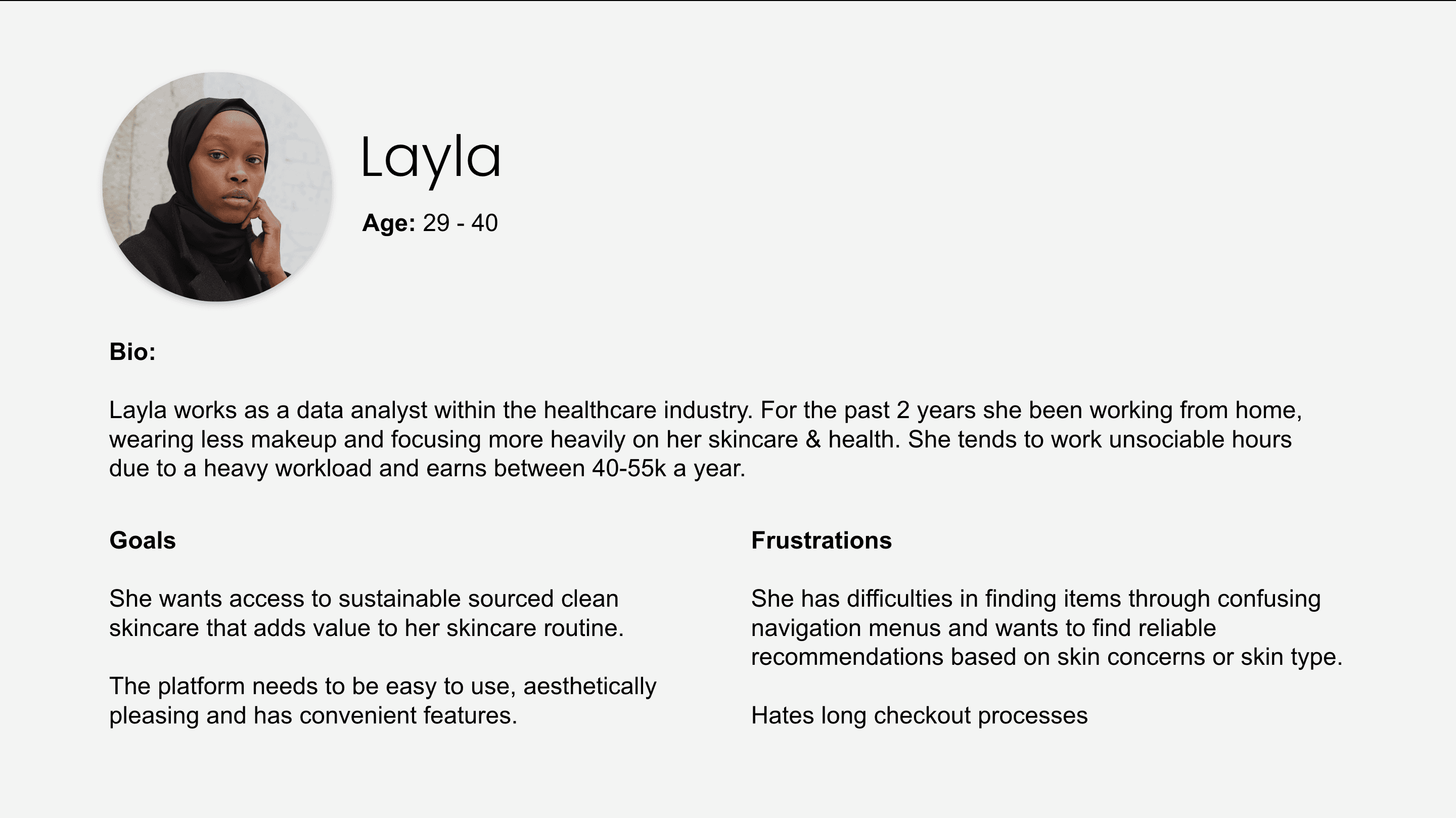
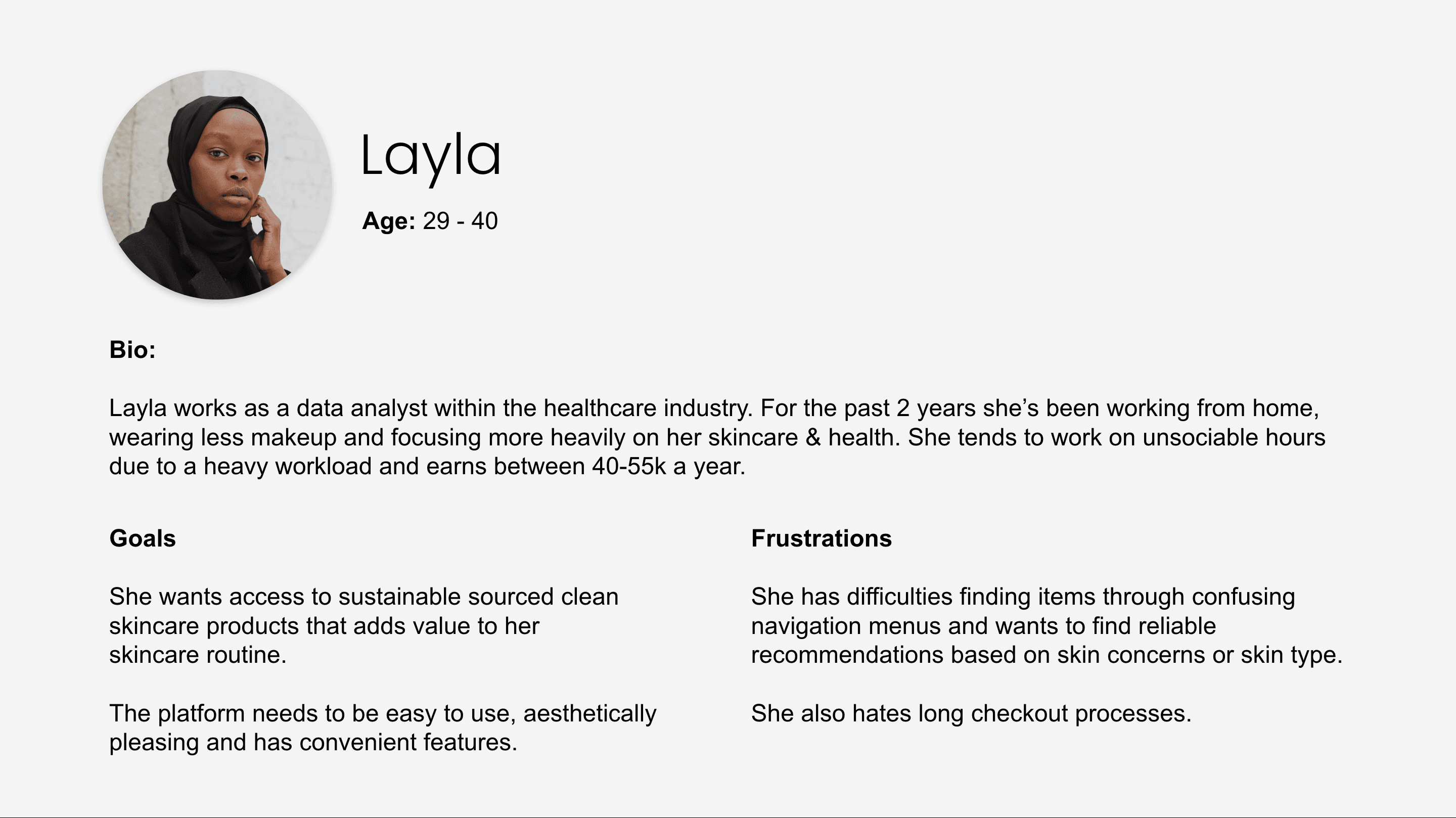
Persona
Before moving onto the ideation and design process, I was able to create
a Persona.
This made it that bit simpler to design for REN Skincare's target market.


Ideation
In order to generate ideas and innovate my design, I carried out 2 ideation techniques that I felt were applicable to this case study. I wanted to focus on solving certain bugbears experienced by consumers of the site and utilised what I had learnt from my research to aid this particular process.

Mind Mapping
Mind mapping was used to outline the main elements and features I would like to include in my design based on my research and what is already on the REN Skincare website.
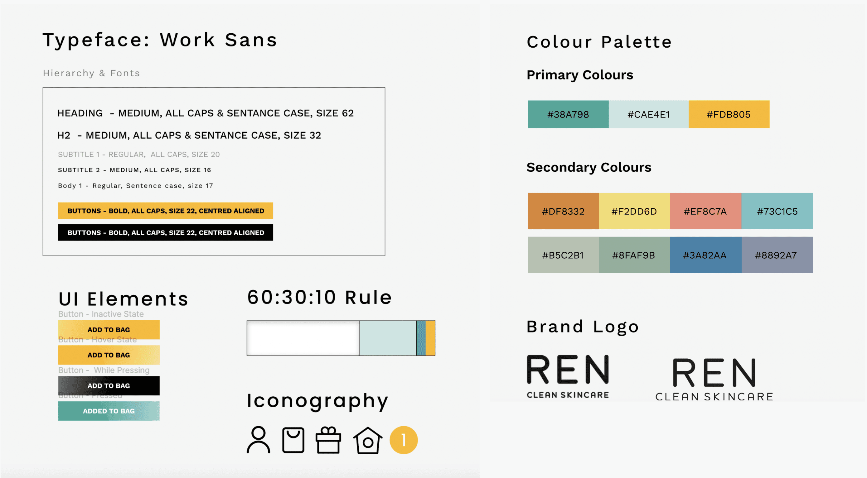
Design System
I made a Design System for this project as they are essential elements for the design of websites. They make it possible to create an important base for all the elements of a site and to speed up the design phase when in collaboration with other designers.
Style Guide


Overview & Reflections
Redesigning the REN Skincare interface through a mixture of UX and UI techniques and thorough User Research, was thoroughly rewarding and enjoyable. I felt that I learnt a lot about inclusive design.
From my research, it was important to update the visual design of the website. So that it better reflected the clean branding and clean products REN Skincare sells. By raising the standard of the user experience (UX) across the whole site. REN Skincare’s aesthetic is simple and sophisticated, and the customer’s user journey needed to reflect this on the site.
Ultimately, the site is simple and user friendly, creating the perfect user experience, and increasing the chance of happy customers converting.
Upon reflection, if I had more time to explore this brief further I would have committed to bringing back the user interviewees and get their perspective on REN Skincare’s new prototypes.
Accessibility
I considered how accessible my design is consistently throughout my design process:
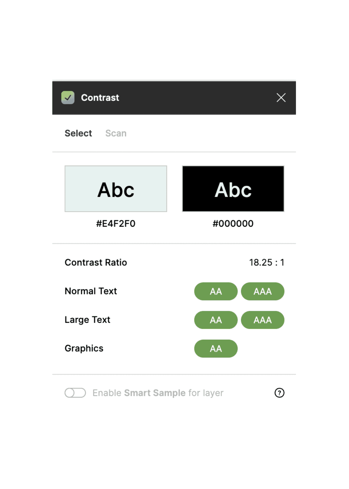
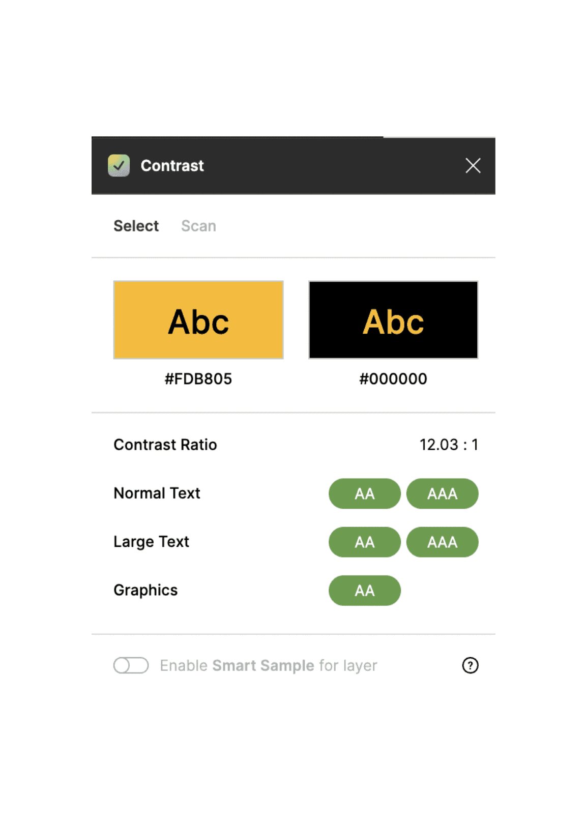
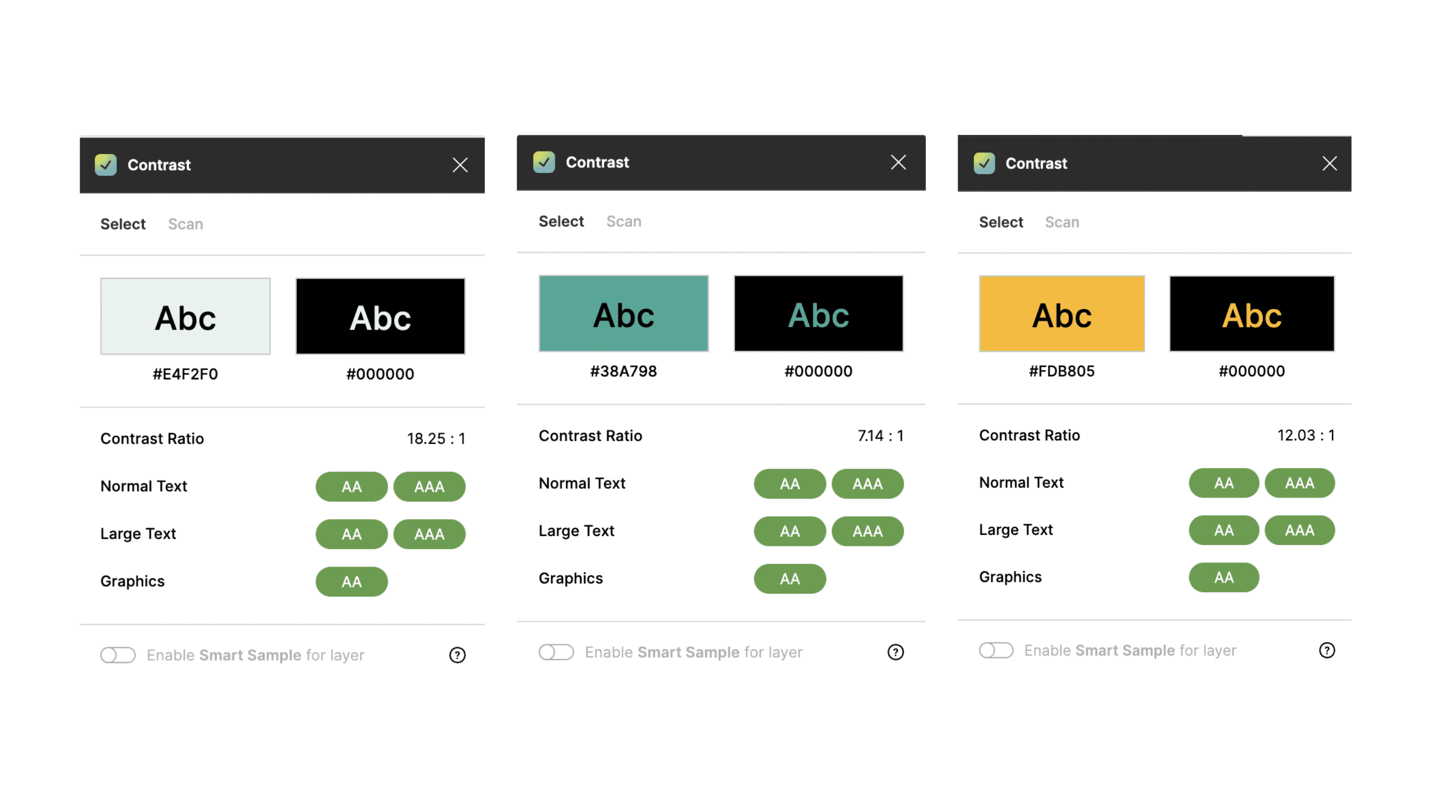
WCAG
I tested my design against the contrast requirements, using a plugin on Figma; Contrast to ensure this was adhered to. Colour contrast received an AAA result.

Logical Hierarchy & Information Architecture
Structuring elements and copy on all pages to represent the intended flow of information.
Apple Human Interface Guidelines
Aesthetic Integrity: I made sure to have the interface promote skincare, it’s primary function. Through sticking to what my research showed me by; showcasing one promotional product on the homepage and by using high quality product imagery across the site. I adhered to the Aesthetic Integrity of REN Skincare brand and an E-commerce site.
Consistency: Staying consistent was paramount when it came to having each page relate to the past one. I wanted to ensure that buttons had the same curvature, paragraph structure remained the same and the colour scheme matched across Mobile & Web.
Text Size: Ensuring all text sizes are 13 points and above.
Crazy 8's
I used a crazy eights session to help me map out the features I wanted to include in the interface.
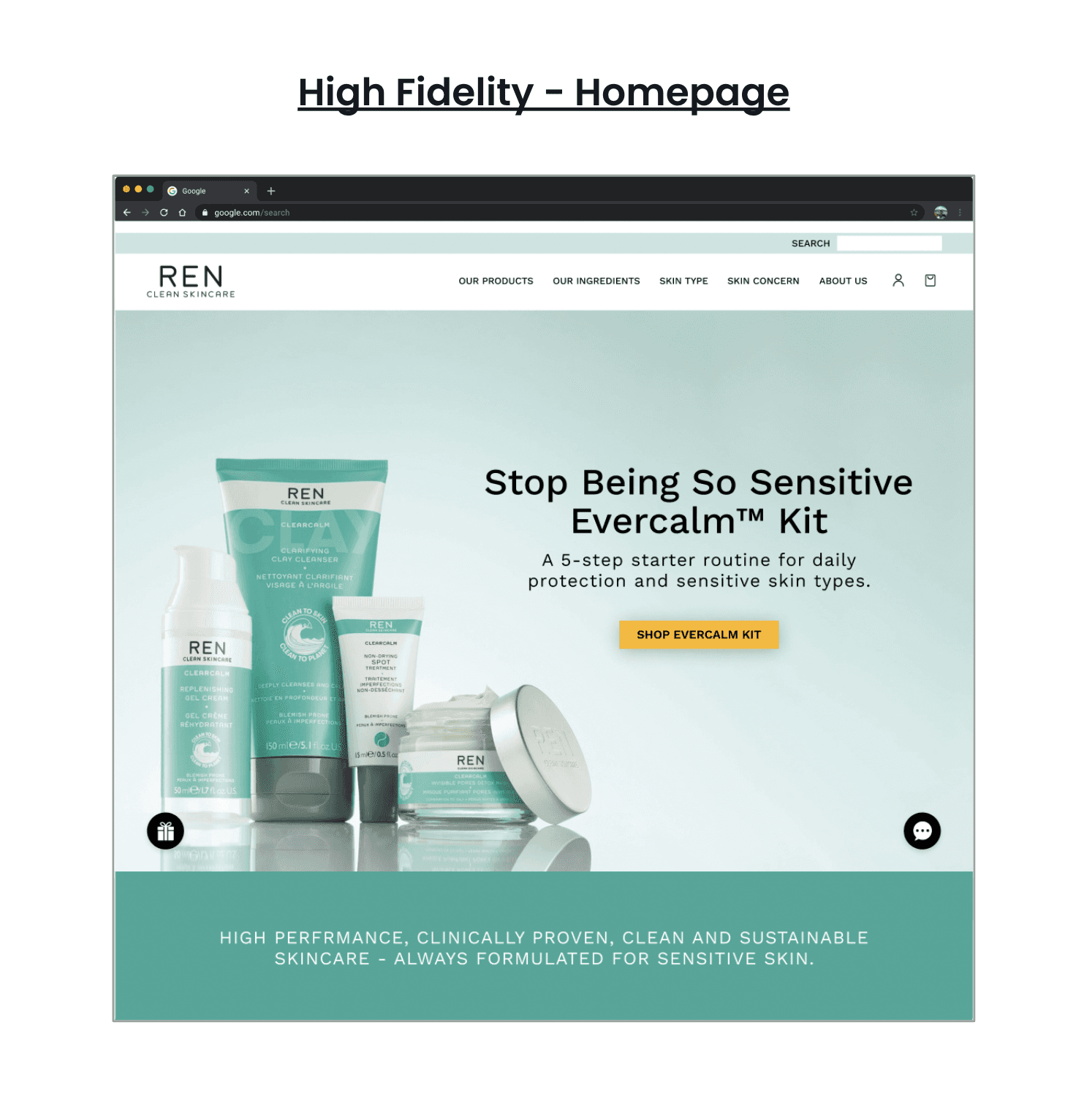
Homepage - Web & Mobile


Product Page - Web & Mobile
Checkout Page - Web & Mobile
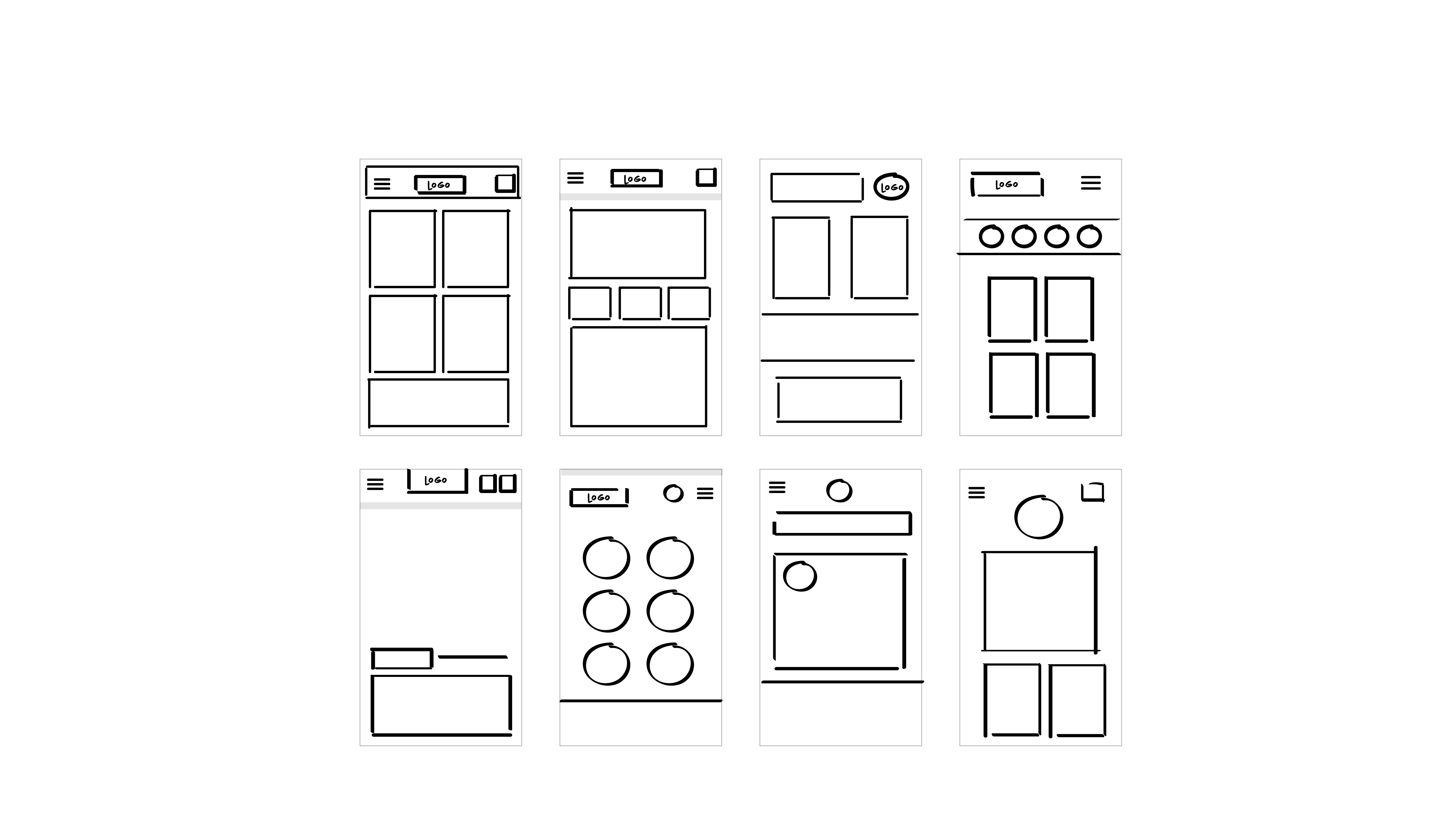
Wireframes
WeBSITE WIREFRAMES


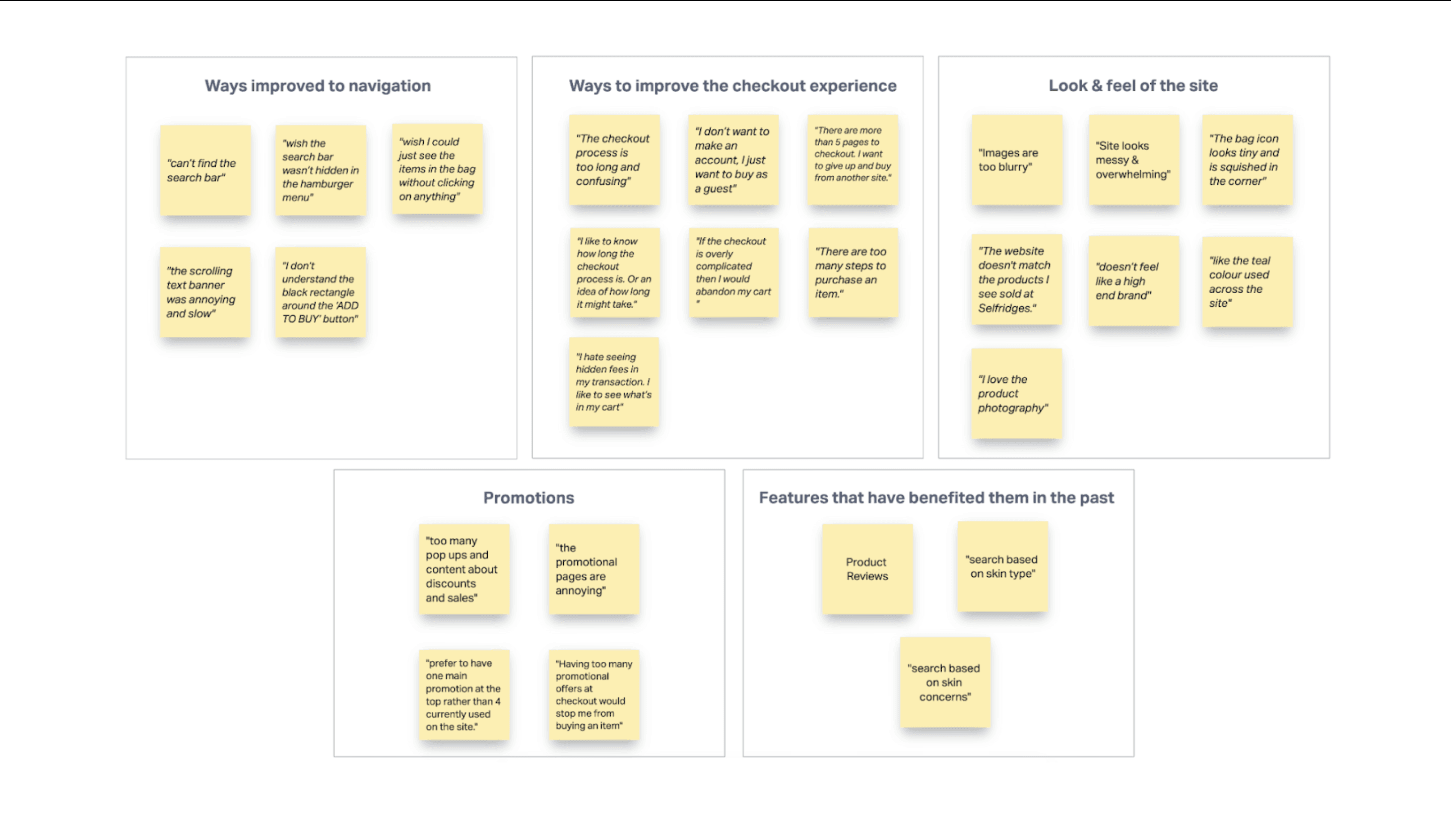
Affinity Mapping
To help me understand the main insights from the above research, I carried out an Affinity Mapping exercise.
This method was very helpful as it helped categorise the assumptions users had into separate themes.


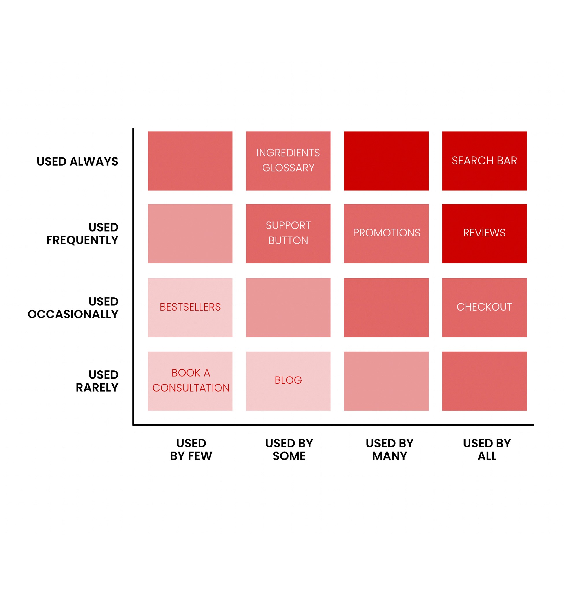
Red Route Analysis
5 volunteers were rallied for this Red Route analysis. Questions were asked about the importance they placed on particular features of the REN Skincare website, how often they’d use them and if they use them at all. They were given a chart of 1 to 4, 1 being the least important and 4 of most importance, and ranked where they’d place each particular feature on that scale.
Research Summary
From my research I defined 5 pain points throughout the REN Skincare website and used these to direct my design choices.
Main Interview takeaways:
Some participants had a lot of difficulties with the navigation bar at the top. Some couldn't see the shopping bag or couldn’t tell how many items were added. Others struggled locating the search bar.
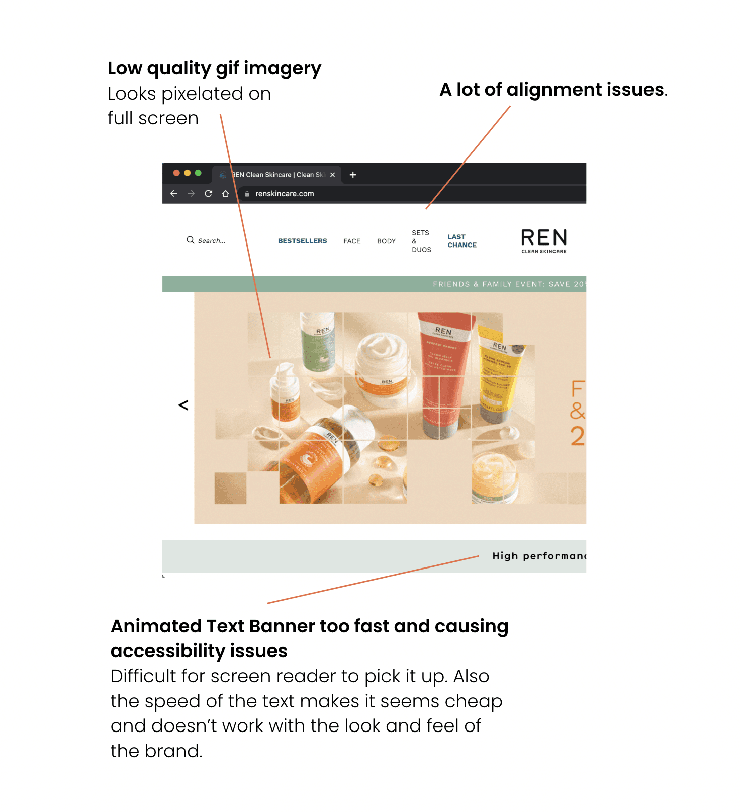
A few participants felt the low quality photos and the misaligned text made the site look cheap and not match the brand.
Two participants said the checkout process was too long and confusing to follow.
A few participants felt overloaded with promotional ads across different pages on the site.
Most participants wanted to search for products based on skin concerns or skin types.
Business Research
I first conducted a website analysis to identify any immediate issues. Doing this allowed me to pinpoint the key areas that needed improvement and focus on them during the redesign.
Hick’s Law suggests that the time it takes to make a decision increases with the amount of choice on a page. By reducing the amount of information on each page, the user will feel less overwhelmed and reduce site abandonment.
The Missing Fundamentals:


Hick’s Law
Miller's Law
Miller's Law suggests the average person can only keep 7 (plus or minus 2) items in their mind
Aesthetic-Usability Effect
Aesthetic-Usability Effect suggests users often perceive aesthetically pleasing design as design that’s more usable.
Law of Common Region
Law of Common Region suggests elements tend to be perceived into groups if they are sharing an area with a clearly defined boundary.
Jakobs Law
Jakobs Law suggests that users spend most of their time on other sites. This means that users prefer your site to work the same way as all the other sites they already know.
Hypothesis
To enhance the aesthetic appeal of the REN Skincare website, aligning it more closely with the clean branding and products they offer. This involves elevating the user experience (UX) throughout the entire site. To explore this, I implemented the following approaches:

Empathise

Define

Ideate

Prototype
Test
Growth of convenient shopping
The E-commerce sector has revolutionized the purchasing, browsing, and transaction processes. It has altered the way customers engage with a brand and invest their time and effort in becoming a part of that brand's narrative. The ongoing expansion of convenience shopping, along with COVID-19, has led to a significant reduction in physical retail stores. As COVID-19 has redefined the way the world operates, companies turned to their online presence to develop a new or enhanced customer experience.
But who are REN Skincare?
REN Skincare is a conscientious skincare company, known for its eco-friendly and pure products. This brand provides exceptional skincare items without compromising on environmental concerns. REN Skincare's style is minimalistic and refined, and the website's user experience should embody this elegance.
Overview & Reflections
Redesigning the REN Skincare interface through a mixture of UX and UI techniques and thorough User Research, was thoroughly rewarding and enjoyable. I felt that I learnt a lot about inclusive design.
From my research, it was important to update the visual design of the website. So that it better reflected the clean branding and clean products REN Skincare sells. By raising the standard of the user experience (UX) across the whole site. REN Skincare’s aesthetic is simple and sophisticated, and the customer’s user journey needed to reflect this on the site.
Ultimately, the site is simple and user friendly, creating the perfect user experience, and increasing the chance of happy customers converting.
Upon reflection, if I had more time to explore this brief further I would have committed to bringing back the user interviewees and get their perspective on REN Skincare’s new prototypes.
Hypothesis
To enhance the aesthetic appeal of the REN Skincare website, aligning it more closely with the clean branding and products they offer. This involves elevating the user experience (UX) throughout the entire site. To explore this, I implemented the following approaches;

Empathise
Define
Ideate
Prototype
Test
Empathise
Define
Ideate
Prototype
Test
Empathise
Define
Ideate
Prototype
Test
Empathise
Business Research
I first conducted a website analysis to identify any immediate issues. Doing this allowed me to pinpoint the key areas that needed improvement and focus on them during the redesign.

The Missing Fundamentals:
Hick’s Law suggests that the time it takes to make a decision increases with the amount of choice on a page. By reducing the amount of information on each page, the user will feel less overwhelmed and reduce site abandonment.
Miller's Law suggests the average person can only keep 7 (plus or minus 2) items in their mind
Aesthetic-Usability Effect suggests users often perceive aesthetically pleasing design as design that’s more usable.
Law of Common Region suggests elements tend to be perceived into groups if they are sharing an area with a clearly defined boundary.
Jakobs Law suggests that users spend most of their time on other sites. This means that users prefer your site to work the same way as all the other sites they already know.

The Problem
For a high end brand, their website focused more on sales. A lot of their consumers rely on buying from other third party sites instead of their own brand website.
The Problem
For a high end brand, their website focused more on sales. A lot of their consumers rely on buying from other third party sites instead of their own brand website.
The Problem
For a high end brand, their website focused more on sales. A lot of their consumers rely on buying from other third party sites instead of their own brand website.
Competitor Analysis
I carried out a competitor analysis for desktop and mobile sites of direct competitors (Biossance & Tatcha), to help inform my UX design process. My Competitor analysis provided insights into the strengths and weaknesses of competitor sites, and which features could be added to the Ren Skincare site to put it in a fair position to compete with competitor brands whilst appealing to the same target market.
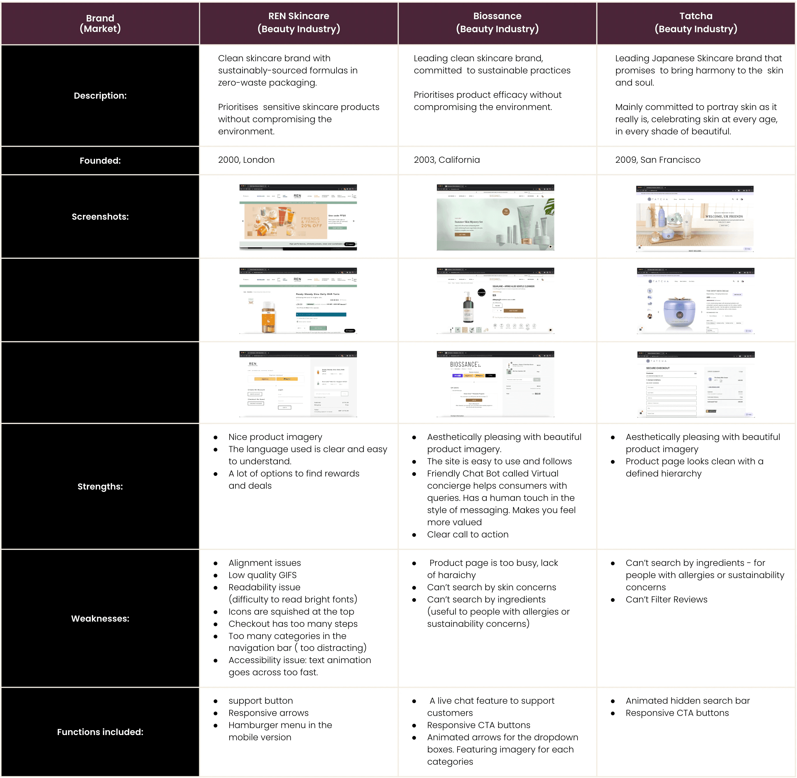
Key Findings
The analysis identified a number of similarities across the competitor websites, these included:
aesthetically pleasing product imagery,
having one main promotion on the homepage.
Clear and easy to find call to action button with a lot of space.
A helpful search function and options to find rewards/deals.
An interesting function was the friendly virtual concierge chatbot found on the Biossance site. It had a human touch in the style of messaging which made consumers feel special and more valued. Resonating to the brands look and feel. Unlike the support button found on the other two sites which lead you to write an email.

2. Define
User Research
After carrying out the competitor analysis, I then felt it important to identify the main routes users use the REN Skincare interface. To identify the most important features of REN Skincare’s site, and to help me with the overall design and concentration on particular areas, I sent around a questionnaire to gather information about what was most important to consumers from the site. This type of quantitative research was useful as it gave me a simple and direct insight into what is important to a consumer of a skincare brand.


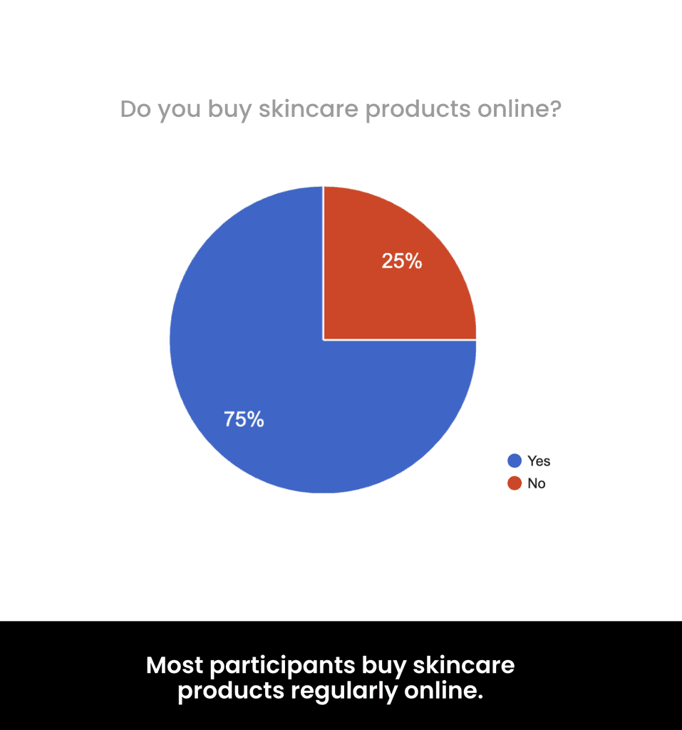


Main Google Survey Takeaways:
Persona
Before moving onto the ideation and design process, I was able to create a Persona.
This made it that bit simpler to design for REN Skincare's target market.
Affinity Mapping
To help me understand the main insights from the above research, I carried out an Affinity Mapping exercise.
This method was very helpful as it helped categorise the assumptions users had into separate themes.
Design System
I made a Design System for this project as they are essential elements for the design of websites. They make it possible to create an important base for all the elements of a site and to speed up the design phase when in collaboration with other designers.
Style Guide
Ideation
In order to generate ideas and innovate my design, I carried out 2 ideation techniques that I felt were applicable to this case study. I wanted to focus on solving certain bugbears experienced by consumers of the site and utilised what I had learnt from my research to aid this particular process.

Mind Mapping
Mind mapping was used to outline the main elements and features I would like to include in my design based on my research and what is already on the REN Skincare website.
User Research
From my research I defined 5 pain points throughout the REN Skincare website and used these to direct my design choices.
Main Interview takeaways:
Some participants had a lot of difficulties with the navigation bar at the top. Some couldn't see the shopping bag or couldn’t tell how many items were added. Others struggled locating the search bar.
A few participants felt the low quality photos and the misaligned text made the site look cheap and not match the brand.
Two participants said the checkout process was too long and confusing to follow.
A few participants felt overloaded with promotional ads across different pages on the site.
Most participants wanted to search for products based on skin concerns or skin types.
Main Google Survey Takeaways:


Red Route Analysis
5 volunteers were rallied for this Red Route analysis. Questions were asked about the importance they placed on particular features of the REN Skincare website, how often they’d use them and if they use them at all. They were given a chart of 1 to 4, 1 being the least important and 4 of most importance, and ranked where they’d place each particular feature on that scale.
User Interviews
To gain a deeper understanding of user pain points and how they navigate the current site, I conducted an interview with 5 participants. I've included the key questions and responses that guided my design solution.
Interview Questions
Interview Questions
1. What was easy or difficult about your experience with using the REN Skincare website?
2. Explain your thoughts aloud as you navigate through the REN Skincare website to purchase a product?
3. What are your thoughts on the content of the homepage?
4. Try to remember the last time you abandoned a cart. How did you feel?
Affinity Mapping
To help me understand the main insights from the above research, I carried out an Affinity
Mapping exercise.
This method was very helpful as it helped categorise the assumptions users
had into separate themes.
Ideation
In order to generate ideas and innovate my design, I carried out 2 ideation techniques that I felt were applicable to this case study. I wanted to focus on solving certain bugbears experienced by consumers of the site and utilised what I had learnt from my research to aid this particular process.
Mind mapping was used to outline the main elements and features I would like to include in my design based on my research and what is already on the REN Skincare website.
Mind Mapping
Design System
I made a Design System for this project as they are essential elements for the design of websites. They make it possible to create an important base for all the elements of a site and to speed up the design phase when in collaboration with other designers.

Style Guide
Accessibility
I considered how accessible my design is consistently throughout my design process:

WCAG
I tested my design against the contrast requirements, using a plugin on Figma; Contrast to ensure this was adhered to. Colour contrast received an AAA result.
Structuring elements and copy on all pages to represent the intended flow of information.
Logical Hierarchy & Information Architecture
Apple Human Interface Guidelines
Aesthetic Integrity: I made sure to have the interface promote skincare, it’s primary function. Through sticking to what my research showed me by; showcasing one promotional product on the homepage and by using high quality product imagery across the site. I adhered to the Aesthetic Integrity of REN Skincare brand and an E-commerce site.
Consistency: Staying consistent was paramount when it came to having each page relate to the past one. I wanted to ensure that buttons had the same curvature, paragraph structure remained the same and the colour scheme matched across Mobile & Web.
Text Size: Ensuring all text sizes are 13 points and above.
Persona
Before moving onto the ideation and design process, I was able to create a Persona. This made it that bit simpler to design for REN Skincare's target market.
Research Summary
From my research I defined 5 pain points throughout the REN Skincare website and used these to direct my design choices.
Main Interview takeaways:
Some participants had a lot of difficulties with the navigation bar at the top. Some couldn't see
the shopping bag or couldn’t tell how many items were added. Others struggled locating the search bar.A few participants felt the low quality photos and the misaligned text made the site look cheap
and not match the brand.Two participants said the checkout process was too long and confusing to follow.
A few participants felt overloaded with promotional ads across different pages on the site.
Most participants wanted to search for products based on skin concerns or skin types.
Research Summary
From my research I defined 5 pain points throughout the REN Skincare website and used these to direct my design choices.
Main Interview takeaways:
Some participants had a lot of difficulties with the navigation bar at the top. Some couldn't see the shopping bag or couldn’t tell how many items were added. Others struggled locating the search bar.
A few participants felt the low quality photos and the misaligned text made the site look cheap and not match the brand.
Two participants said the checkout process was too long and confusing to follow.
A few participants felt overloaded with promotional ads across different pages on the site.
Most participants wanted to search for products based on skin concerns or skin types.
Persona
Before moving onto the ideation and design process, I was able to create a Persona.
This made it that bit simpler to design for REN Skincare's target market.
3. Analysing Data
Affinity Mapping
To help me understand the main insights from the above research, I carried out an Affinity Mapping exercise.
This method was very helpful as it helped categorise the assumptions users had into separate themes.
4. Ideation
Ideation
In order to generate ideas and innovate my design, I carried out 2 ideation techniques that I felt were applicable to this case study. I wanted to focus on solving certain bugbears experienced by consumers of the site and utilised what I had learnt from my research to aid this particular process.
Mind Mapping
Mind mapping was used to outline the main elements and features I would like to include in my design based on my research and what is already on the REN Skincare website.
Crazy 8's - Mobile & Web
I used a crazy eights session to help me map out the features I wanted to include in the interface.
Homepage
Product Page
Checkout Page
Web Page Wireframes
Low Fidelity
Mid Fidelity
High Fidelity
Crazy 8's - Mobile & Web
I used a crazy eights session to help me map out the features I wanted to include in the interface.
Homepage
Product Page
Checkout Page
Mobile Wireframes
Homepage


Product Page


Checkout Page


MOBILE WIREFRAMES
Mobile Wireframes
Homepage Wireframes
Product Page Wireframes
Checkout Page Wireframes
-
-
Design System
I made a Design System for this project as they are essential elements for the design of websites. They make it possible to create an important base for all the elements of a site and to speed up the design phase when in collaboration with other designers.
Style Guide
Prototype
Website Prototype
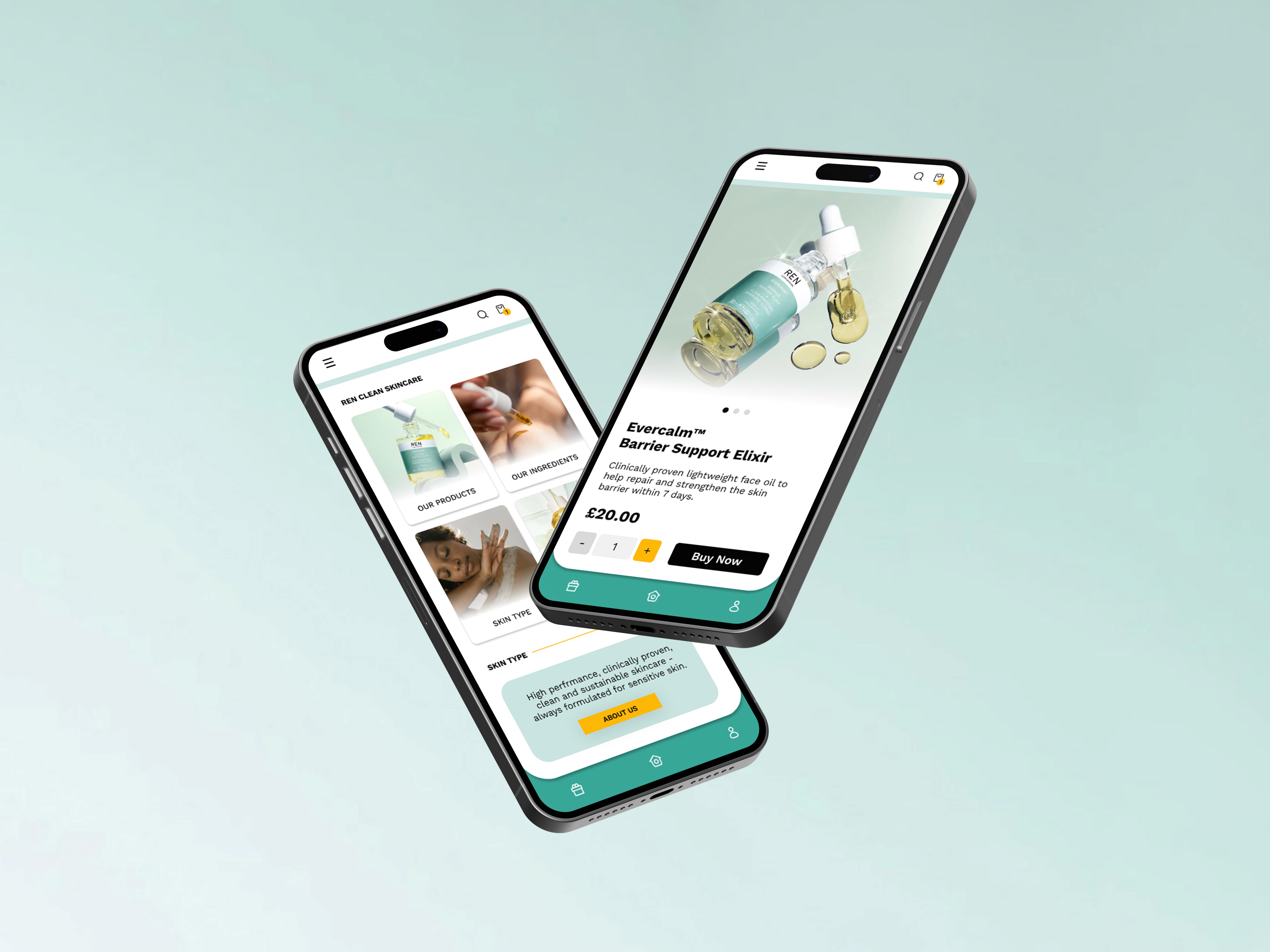
Mobile Prototype
Test
Accessibility
I considered how accessible my design is consistently throughout my design process:
WCAG
I tested my design against the contrast requirements, using a plugin on Figma; Contrast to ensure this was adhered to. Colour contrast received an AAA result.
Logical Hierarchy & Information Architecture
Structuring elements and copy on all pages to represent the intended flow of information.
Apple Human Interface Guidelines
Aesthetic Integrity: I made sure to have the interface promote skincare, it’s primary function. Through sticking to what my research showed me by; showcasing one promotional product on the homepage and by using high quality product imagery across the site. I adhered to the Aesthetic Integrity of REN Skincare brand and an E-commerce site.
Consistency: Staying consistent was paramount when it came to having each page relate to the past one. I wanted to ensure that buttons had the same curvature, paragraph structure remained the same and the colour scheme matched across Mobile & Web.
Text Size: Ensuring all text sizes are 13 points and above.
Overview & Reflections
Redesigning the REN Skincare interface through a mixture of UX and UI techniques and thorough User Research, was thoroughly rewarding and enjoyable. I felt that I learnt a lot about inclusive design.
From my research, it was important to update the visual design of the website. So that it better reflected the clean branding and clean products REN Skincare sells. By raising the standard of the user experience (UX) across the whole site. REN Skincare’s aesthetic is simple and sophisticated, and the customer’s user journey needed to reflect this on the site.
Ultimately, the site is simple and user friendly, creating the perfect user experience, and increasing the chance of happy customers converting.
Upon reflection, if I had more time to explore this brief further I would have committed to bringing back the user interviewees and get their perspective on REN Skincare’s new prototypes.
Webpage Wireframes
Low Fidelity
Product Page Wireframes
Checkout Page Wireframes
Website Prototype
Mobile Prototype
Website Prototype
Mobile Prototype