Night Light
UX/UI Case Study
UX/UI Case Study
UX/UI Case Study
The Brief
I was tasked to create an app that aims to eliminate the pressures associated with homelessness. A toolkit was needed to bridge the gap between the homeless community and resources that are available to them. I created Night Light to provide access and help a homeless person successfully integrate into the local community.
I was tasked to create an app that aims to eliminate the pressures associated with homelessness. A toolkit was needed to bridge the gap between the homeless community and resources that are available to them.
I created Night Light to provide access and help a homeless person successfully integrate into the local community.
Client
Client
Love Circular
Duration
Duration
2 Weeks
Role
Role
UX Researcher & UI Designer
Year
Year
2022
The Brief
I was tasked to create an app that aims to eliminate the pressures associated with homelessness. A toolkit was needed to bridge the gap between the homeless community and resources that are available to them. I created Night Light to provide access and help a homeless person successfully integrate into the local community.
Client
Duration
Ren Skincare
2 Weeks
Role
UX & UI Designer
Year
2022

How has homelessness changed over the past 10 years?
The definition of homelessness means not having a home. You are homeless if you have nowhere to stay and are living on the streets, but you can be homeless even if you have a roof over your head.
An increasing number of people in the UK are experiencing homelessness caused by pressures on the housing market, stagnating wages, an increasing shortfall between housing benefits and housing costs, and mental health challenges.
On any given night, tens of thousands of families and individuals are experiencing the worst forms of homelessness across the UK, this includes over 200,000 households in England alone.
For the last five years’ core homelessness has been rising year on year in England, reaching a peak just before the pandemic. [CRISIS, UK. 2022]

What impact has COVID-19 had on homelessness?

Coronavirus pandemic has put a spotlight on the dangers of sleeping rough. Homeless people were at a particular risk of contracting the COVID-19 coronavirus.
During the first few months of the pandemic, the increase was driven by those already experiencing homelessness - people who were sofa surfing and living in dangerous and transient accommodation – who became more visible as their living situations forced them to access help.
Towards the second wave of the pandemic, there have been bigger increases from people who are experiencing homelessness for the first time, people who have been furloughed and those who are newly unemployed.
The Problem
According to Crisis Charity, 9/10 rough sleepers had mental health issues and 60% of them were undiagnosed.
A toolkit is needed to bridge the gap between the homeless community and resources that are available to them. Although many of the apps had over 100k downloads on google play, they didn’t cater to vulnerable individuals. They need an app that provides access to mental health services as well as being aware of local resources they might need.
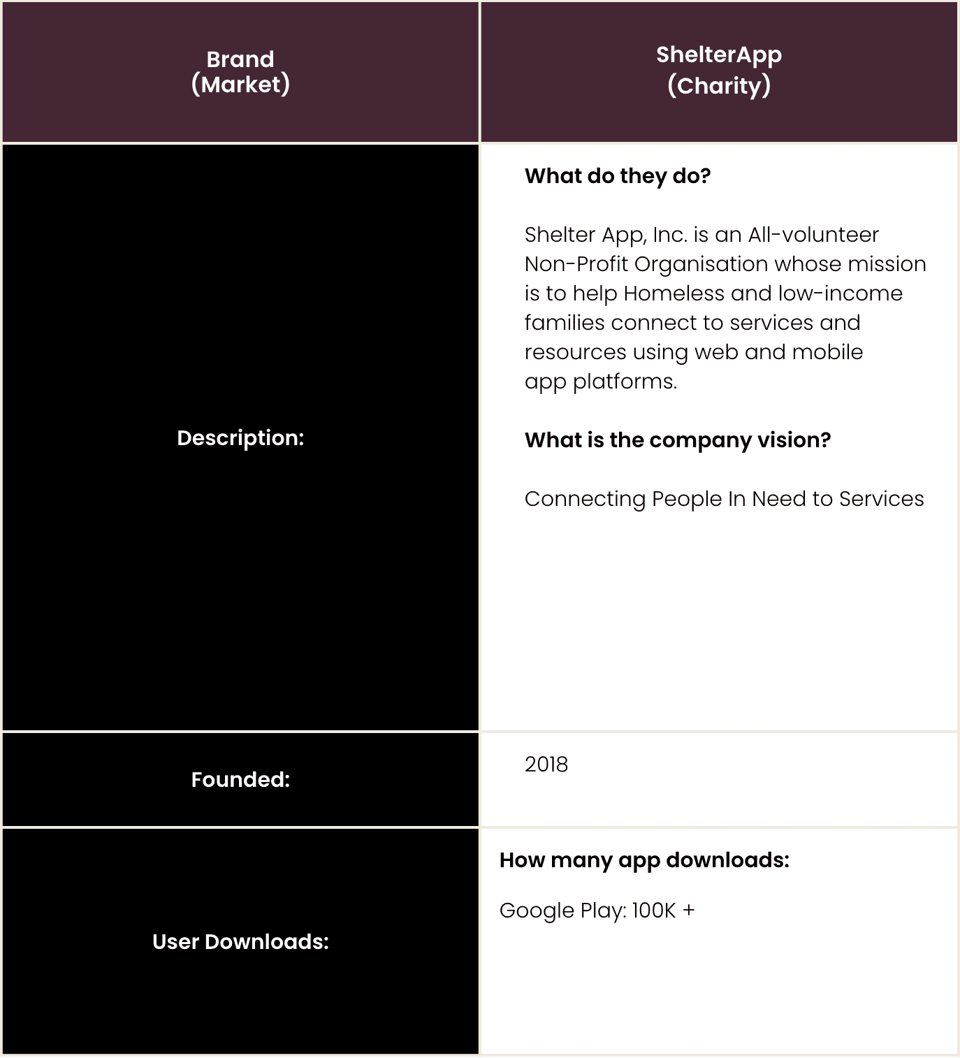
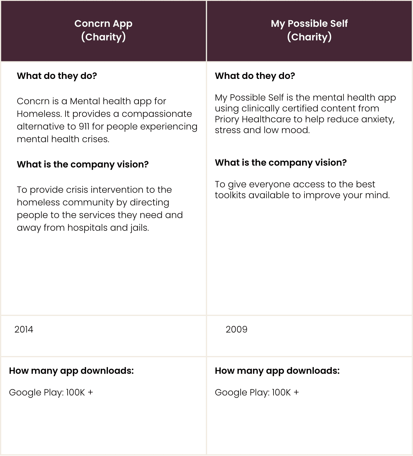
Competitor Analysis
To lead my research I carried out an indirect competitor analysis. An activity which provides an assessment of the strengths and weaknesses of current and potential competitors. By identifying trends and commonalities it can identify market gaps and can help navigate the development of new products.
Acknowledging the reality that I had limited knowledge in this area, I wanted to identify the provisions currently available, trends across content style, functionality and where possible, the gaps my design could fulfil.
To look at this I assessed Shelter App, Concrn App & My Possible Self App. With a specific focus on how they serve their communities; the prevention methods they contribute and the practical benefits their products deliver to their users.
Key Findings:
App Screenshots:
The analysis identified a number of similarities across the competitor brands; These were practices such as:
the emergency button
a directory map of nearby services
support contact
a Chatbot.
another interesting function was the presence of secure formats of recording information which could be shared with local authorities.
Although varied, there was a general consensus across the brands to establish safe spaces for their users and prioritise sharing information that would either educate or alleviate current/potential outcomes of homelessness and mental health.
These are just some of the functions I will be considering implementing during my own design process.


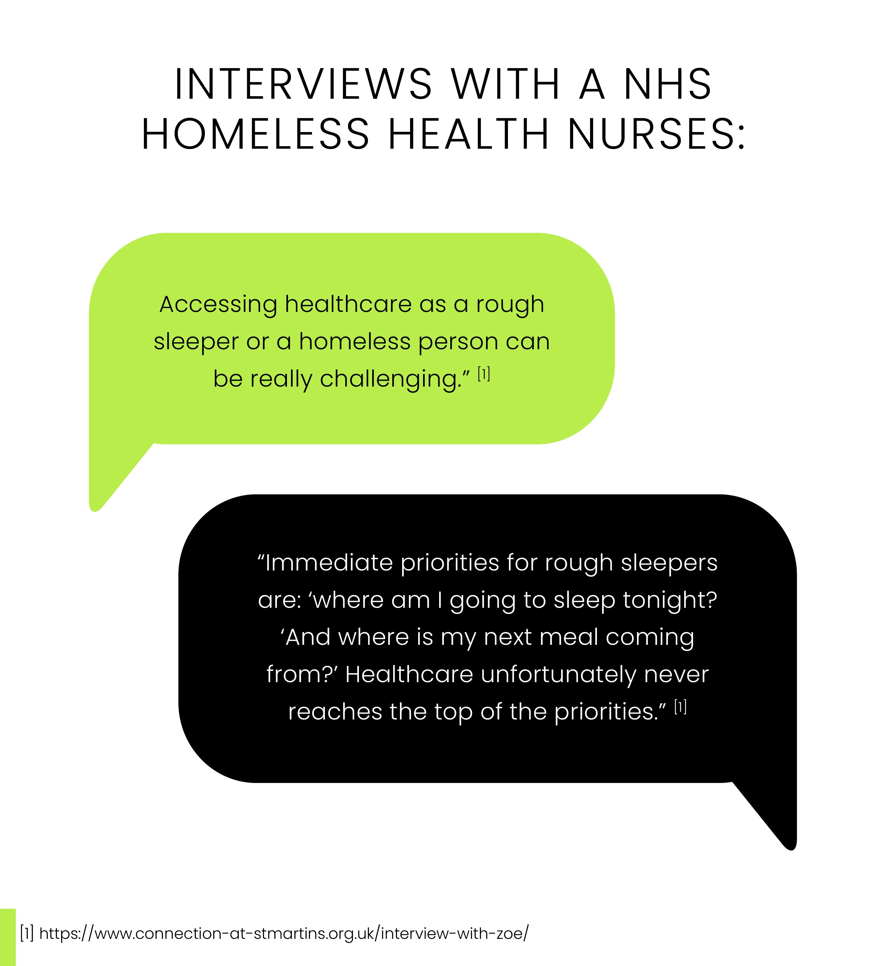
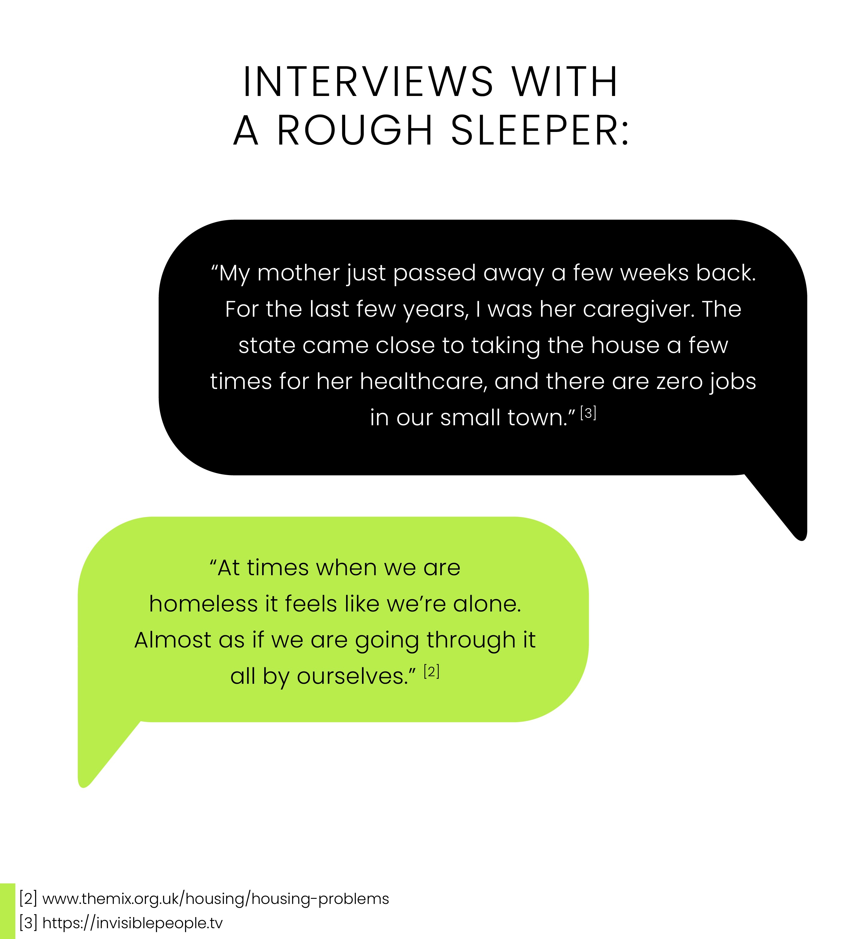
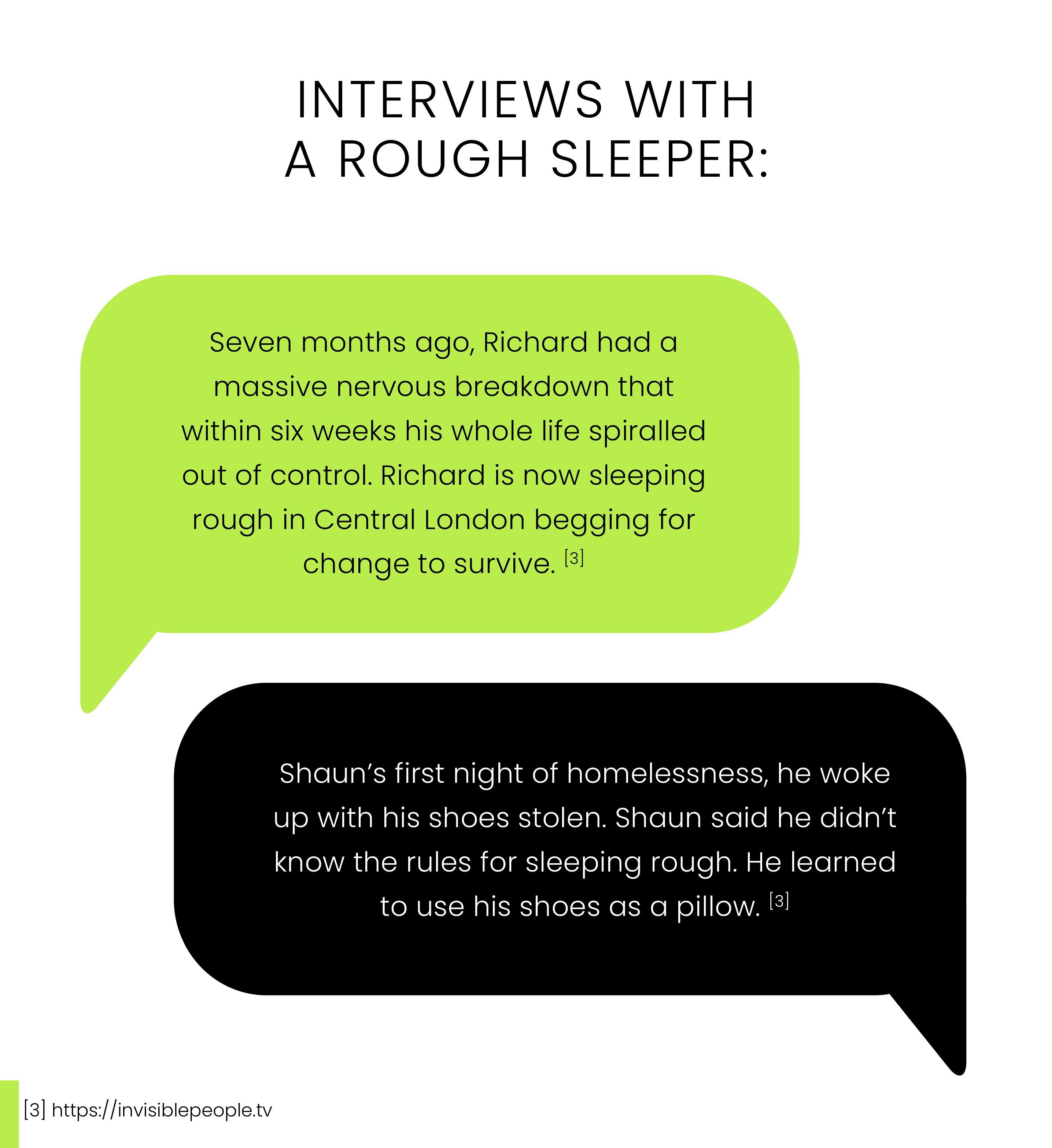
User Research
My user research was mainly derived from secondary research, such as reports from charities and media interviews with people experiencing homelessness. This research helped me empathise with people experiencing homelessness in understanding what they need.


Ideation
At this point clear themes were beginning to unveil themselves. To utilise the insights gained from the research stage I applied the use of two ideation techniques; Crazy 8’s and Mind Mapping.

Crazy 8s
Mind Mapping: To conclude I conducted a mind map. This technique allowed me to pool all my conceptual ideas onto a “white board” and build upon avenues that could solve this problem.
Mind Mapping

This led to defining 4 main features user need in the app:
Crisis button: links to emergency services
Resources link: Directory map of nearby services
Support Chat: A daily dairy or chatbot to combat loneliness
Heath section that leads to a lifestyle quiz, which gives advice based on recommendations
Design System
I made a Design System for this project as they are essential elements for the design of an app. They make it possible to create an important base for all the elements of an app and to speed up the design phase when in collaboration with other designers.
Style Guide


Brand Logo
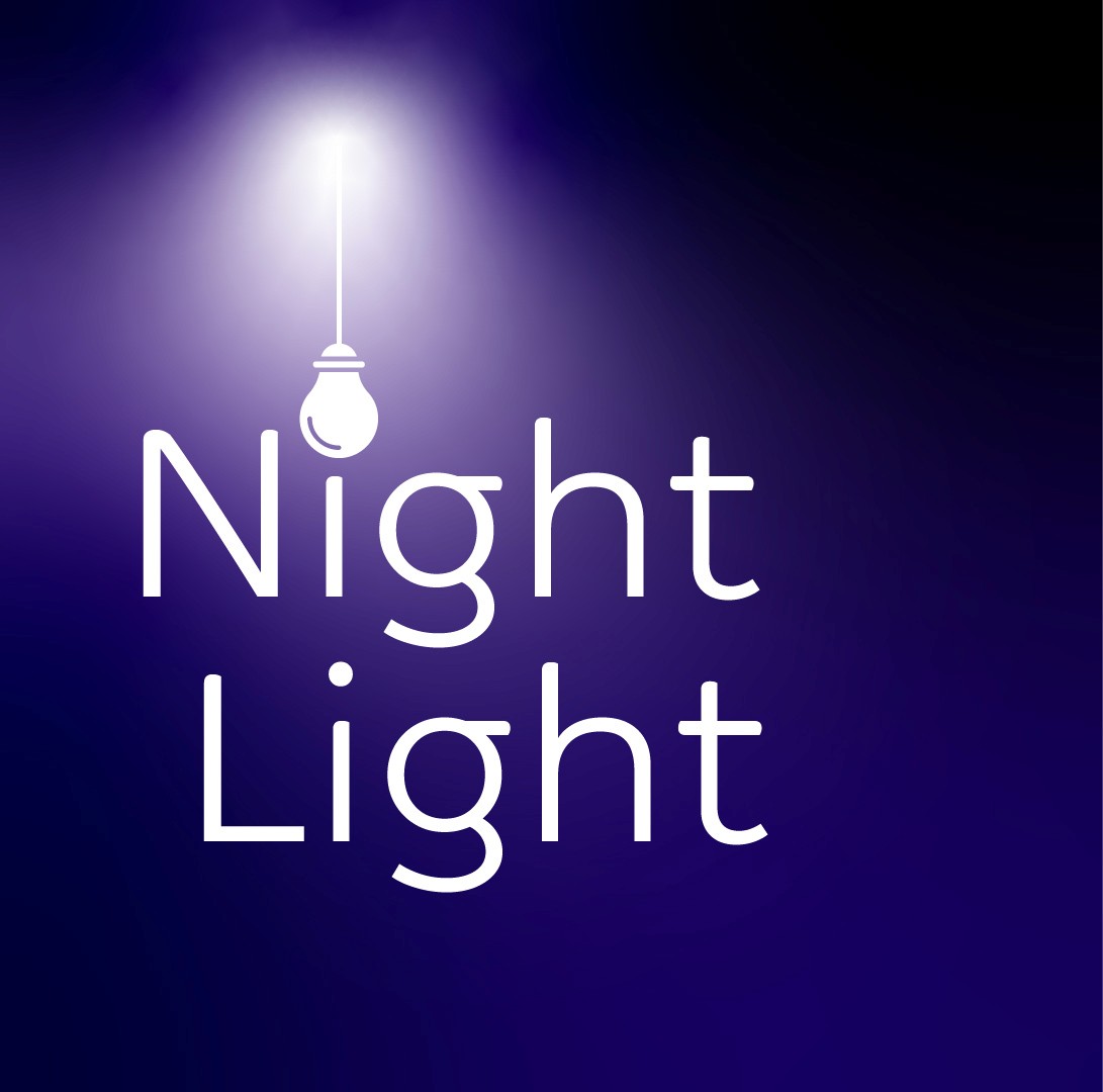
I named the app night light, as I wanted it to connote a sense of safety and comfort.
Based on my user research, many homeless individuals feel unseen and misunderstood.
Giving them an app that lets them control which resources they need might help them take the steps back into society.
Overview & Reflections
Based on my user research, many homeless individuals feel unseen and misunderstood. Giving them an app that lets them control which resources they need might help them take the steps back into society.
A toolkit was needed to bridge the gap between the homeless community and resources that are available to them. I created night light to provide access to mental health services as well as being aware of local resources they might need.
If I was to complete this app, I would have had more first hand user research and also further developed the lifestyle quiz with mental health professionals.
I had a chance to reflect during the creation of the app and it became a truly meaningful design process and an interesting problem to solve.
Accessibility
I considered how accessible my design is consistently throughout my design process:
WCAG
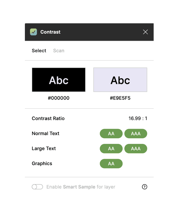
I tested my design against the contrast requirements, using a plugin on Figma; Contrast to ensure this was adhered to. Colour contrast received an AAA result.


Logical Hierarchy & Information Architecture
Structuring elements and copy on all pages to represent the intended flow of information.
Aesthetic-Usability Effect
Based on the research users often perceive aesthetically pleasing design as design that’s more usable. Unfortunately aesthetics design is not considered in many homeless apps. To support this community I made the app aesthetically pleasing using minimal icons and light colours that connote to a calmer friendlier tones.
Consistency
I wanted to ensure that buttons had the same curvature, paragraph structure remained the same and the colour scheme matched across App.
Text Size
Ensuring all text sizes are 13 points and above.
Law of Common Region
I separated elements by using a lot of white space in between items or by using coloured sections throughout the app. This clearly helped define boundaries and put elements into sections
Affinity Mapping
To help me understand the main insights from the above research, I carried out an Affinity Mapping exercise.
Sections were developed in relation to common themes and areas of interest highlighted in the research. Such as resources used in the past, support they’ve found to be useful and quotes from their experience.
This method was very helpful as it helped categorise the assumptions users had into separate themes.


Hypothesis
To create an app that supports and educates user's on relevant material that can help a homeless person with mental health issues successfully integrate into a local community. By providing access to mental health services and reducing their chances of sleeping rough. To explore this, I implemented the following approaches;

User Research

Ideation

Analysis

Business Research
Prototyping
How has homelessness changed over the past 10 years?
The definition of homelessness means not having a home. You are homeless if you have nowhere to stay and are living on the streets, but you can be homeless even if you have a roof over your head.
An increasing number of people in the UK are experiencing homelessness caused by pressures on the housing market, stagnating wages, an increasing shortfall between housing benefits and housing costs, and mental health challenges.
On any given night, tens of thousands of families and individuals are experiencing the worst forms of homelessness across the UK, this includes over 200,000 households in England alone.
For the last five years’ core homelessness has been rising year on year in England, reaching a peak just before the pandemic. [CRISIS, UK. 2022]
What impact has COVID-19
had on homelessness?
What impact has COVID-19 had on homelessness?
Coronavirus pandemic has put a spotlight on the dangers of sleeping rough. Homeless people were at a particular risk of contracting the COVID-19 coronavirus.
During the first few months of the pandemic, the increase was driven by those already experiencing homelessness - people who were sofa surfing and living in dangerous and transient accommodation – who became more visible as their living situations forced them to access help.
Towards the second wave of the pandemic, there have been bigger increases from people who are experiencing homelessness for the first time, people who have been furloughed and those who are newly unemployed.
Overview & Reflections
Based on my user research, many homeless individuals feel unseen and misunderstood. Giving them an app that lets them control which resources they need might help them take the steps back into society.
A toolkit was needed to bridge the gap between the homeless community and resources that are available to them. I created night light to provide access to mental health services as well as being aware of local resources they might need.
If I was to complete this app, I would have had more first hand user research and also further developed the lifestyle quiz with mental health professionals.
I had a chance to reflect during the creation of the app and it became a truly meaningful design process and an interesting problem to solve.
Hypothesis
To create an app that supports and educates user's on relevant material that can help a homeless person with mental health issues successfully integrate into a local community. By providing access to mental health services and reducing their chances of sleeping rough. To explore this, I implemented the following approaches;

User Research
Ideation
Analysis
Business Research
Prototyping
Business Research
User Research
Analysis
Ideation
Prototyping
Business Research
User Research
Analysis
Ideation
Prototyping
Business Research
Competitor Analysis
To lead my research I carried out an indirect competitor analysis. An activity which provides an assessment of the strengths and weaknesses of current and potential competitors. By identifying trends and commonalities it can identify market gaps and can help navigate the development of new products.
Acknowledging the reality that I had limited knowledge in this area, I wanted to identify the provisions currently available, trends across content style, functionality and where possible, the gaps my design could fulfil.
To look at this I assessed Shelter App, Concrn App & My Possible Self App. With a specific focus on how they serve their communities; the prevention methods they contribute and the practical benefits their products deliver to their users.


Key Findings
The analysis identified a number of similarities across the competitor brands; These were practices such as:
the emergency button
a directory map of nearby services
support contact
a Chatbot.
another interesting function was the presence of secure formats of recording information which could be shared with local authorities.
Although varied, there was a general consensus across the brands to establish safe spaces for their users and prioritise sharing information that would either educate or alleviate current/potential outcomes of homelessness and mental health. These are just some of the functions I will be considering implementing during my own design process.
2. Define
User Research
My user research was mainly derived from secondary research, such as reports from charities and media interviews with people experiencing homelessness. This research helped me empathise with people experiencing homelessness in understanding what they need.


The Problem
According to Crisis Charity, 9/10 rough sleepers had mental health issues and 60% of them were undiagnosed.
A toolkit is needed to bridge the gap between the homeless community and resources that are available to them. Although many of the apps had over 100k downloads on google play, they didn’t cater to vulnerable individuals. They need an app that provides access to mental health services as well as being aware of local resources they might need.
Affinity Mapping
To help me understand the main insights from the above research, I carried out an Affinity Mapping exercise.
Sections were developed in relation to common themes and areas of interest highlighted in the research. Such as resources used in the past, support they’ve found to be useful and quotes from their experience.
This method was very helpful as it helped categorise the assumptions users had into separate themes.

Design System
I made a Design System for this project as they are essential elements for the design of an app. They make it possible to create an important base for all the elements of an app and to speed up the design phase when in collaboration with other designers.
Style Guide

Brand Logo

I named the app night light, as I wanted it to connote a sense of safety and comfort. Based on my user research, many homeless individuals feel unseen and misunderstood. Giving them an app that lets them control which resources they need might help them take the steps back into society.
At this point clear themes were beginning to unveil themselves. To utilise the insights gained from the research stage I applied the use of two ideation techniques; Crazy 8’s and Mind Mapping.
Crazy 8's - Mobile

Mind Mapping
Mind Mapping: To conclude I conducted a mind map. This technique allowed me to pool all my conceptual ideas onto a “white board” and build upon avenues that could solve this problem.
This led to defining 4 main features user need in the app:
Crisis button: links to emergency services
Resources link: Directory map of nearby services
Support Chat: A daily dairy or chatbot to combat loneliness
Heath section that leads to a lifestyle quiz, which gives advice based on recommendations
Affinity Mapping
To help me understand the main insights from the above research, I carried out an Affinity Mapping exercise.
Sections were developed in relation to common themes and areas of interest highlighted in the research. Such as resources used in the past, support they’ve found to be useful and quotes from their experience.
This method was very helpful as it helped categorise the assumptions users
had into separate themes.
At this point clear themes were beginning to unveil themselves. To utilise the insights gained from the research stage I applied the use of two ideation techniques; Crazy 8’s and Mind Mapping.
Mind Mapping: To conclude I conducted a mind map. This technique allowed me to pool all my conceptual ideas onto a “white board” and build upon avenues that could solve this problem.
Mind Mapping
Crazy 8's - Mobile
This led to defining 4 main features user need in the app:
Crisis button: links to emergency services
Resources link: Directory map of nearby services
Support Chat: A daily dairy or chatbot to combat loneliness
Heath section that leads to a lifestyle quiz, which gives advice based on recommendations
Design System
I made a Design System for this project as they are essential elements for the design of an app. They make it possible to create an important base for all the elements of an app and to speed up the design phase when in collaboration with other designers.
Style Guide
Brand Logo

I named the app night light, as I wanted it to connote a sense of safety and comfort. Based on my user research, many homeless individuals feel unseen and misunderstood. Giving them an app that lets them control which resources they need might help them take the steps back into society.
Accessibility
One main element of the brief was to design with accessibility in mind. So that a range of individuals across abilities and differentiating needs could access the product. Therefore it was important my design met key principles as governed by the WCAG regulations.

WCAG
I tested my design against the contrast requirements, using a plugin on Figma; Contrast to ensure this was adhered to. Colour contrast received an AAA result.
Structuring elements and copy on all pages to represent the intended flow of information.
Logical Hierarchy & Information Architecture
Aesthetic-Usability Effect
Based on the research users often perceive aesthetically pleasing design as design that’s more usable. Unfortunately aesthetics design is not considered in many homeless apps. To support this community I made the app aesthetically pleasing using minimal icons and light colours that connote to a calmer friendlier tones.
Consistency
I wanted to ensure that buttons had the same curvature, paragraph structure remained the same and the colour scheme matched across App.
Text Size
Ensuring all text sizes are 13 points and above.
Law of Common Region
I separated elements by using a lot of white space in between items or by using coloured sections throughout the app. This clearly helped define boundaries and put elements into sections
3. Analysing Data
Affinity Mapping
To help me understand the main insights from the above research, I carried out an Affinity Mapping exercise.
Sections were developed in relation to common themes and areas of interest highlighted in the research. Such as resources used in the past, support they’ve found to be useful and quotes from their experience.
This method was very helpful as it helped categorise the assumptions users had into separate themes.
4. Ideation
At this point clear themes were beginning to unveil themselves. To utilise the insights gained from the research stage I applied the use of two ideation techniques; Crazy 8’s and Mind Mapping.
Crazy 8's - Mobile
Mind Mapping
Mind Mapping: To conclude I conducted a mind map. This technique allowed me to pool all my conceptual ideas onto a “white board” and build upon avenues that could solve this problem.
This led to defining 4 main features user need in the app:
Crisis button: links to emergency services
Resources link: Directory map of nearby services
Support Chat: A daily dairy or chatbot to combat loneliness
Heath section that leads to a lifestyle quiz, which gives advice based on recommendations
Mobile Wireframes
Following the ideation stage I felt confident to begin wireframing possible solutions to the problem at hand.Following the ideation stage I felt confident to begin wireframing possible solutions to the problem at hand.
Following the ideation stage I felt confident to begin wireframing possible solutions to the problem at hand.
Low Fidelity Wireframes

Low Fidelity Wireframes
Mobile Wireframes
Low Fidelity Wireframes
Mid Fidelity Wireframes
High Fidelity Wireframes
-

Mid Fidelity Wireframes
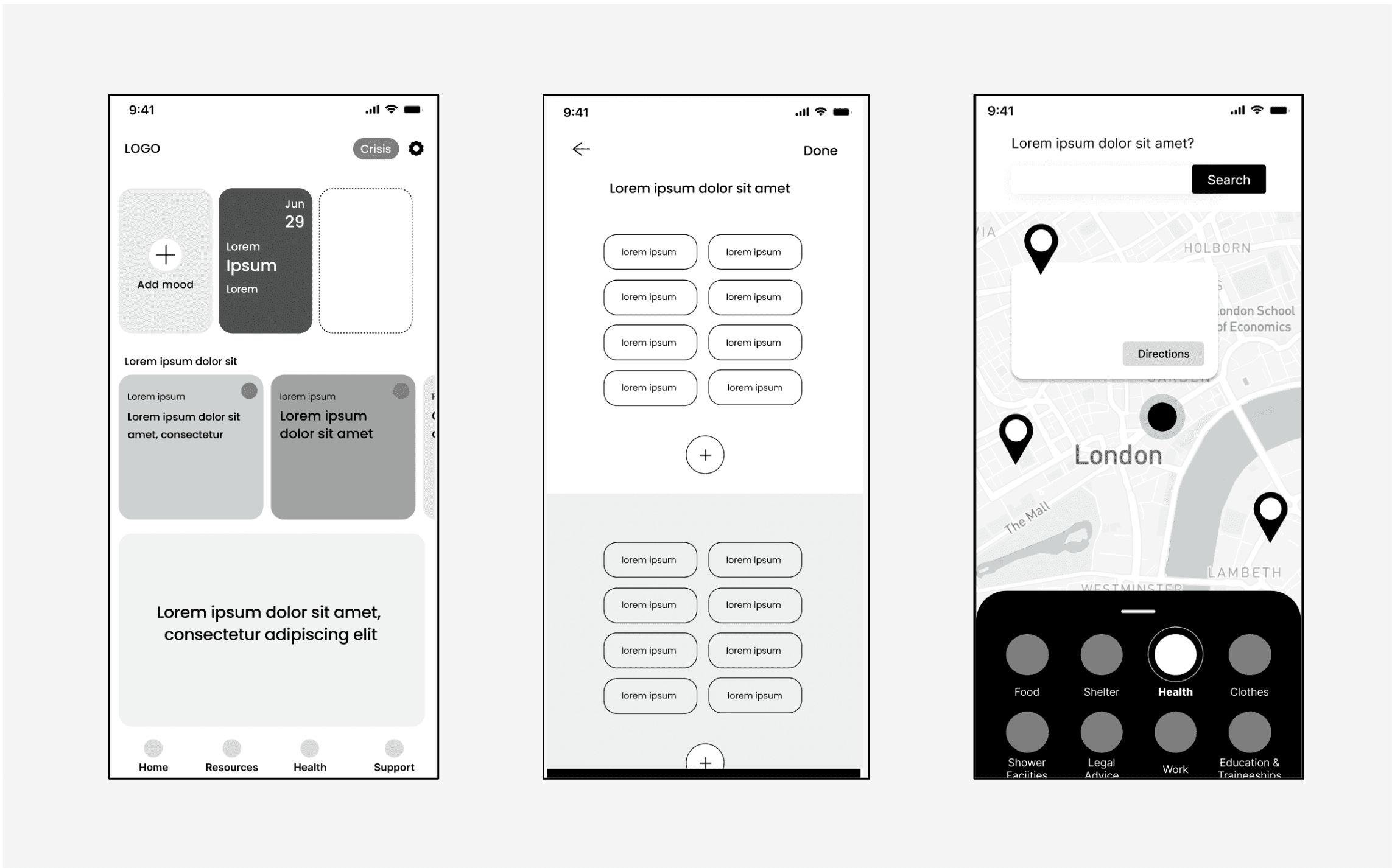
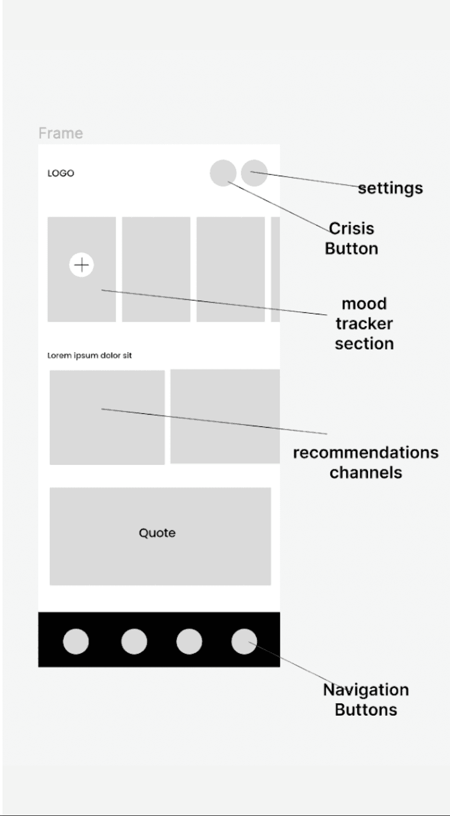
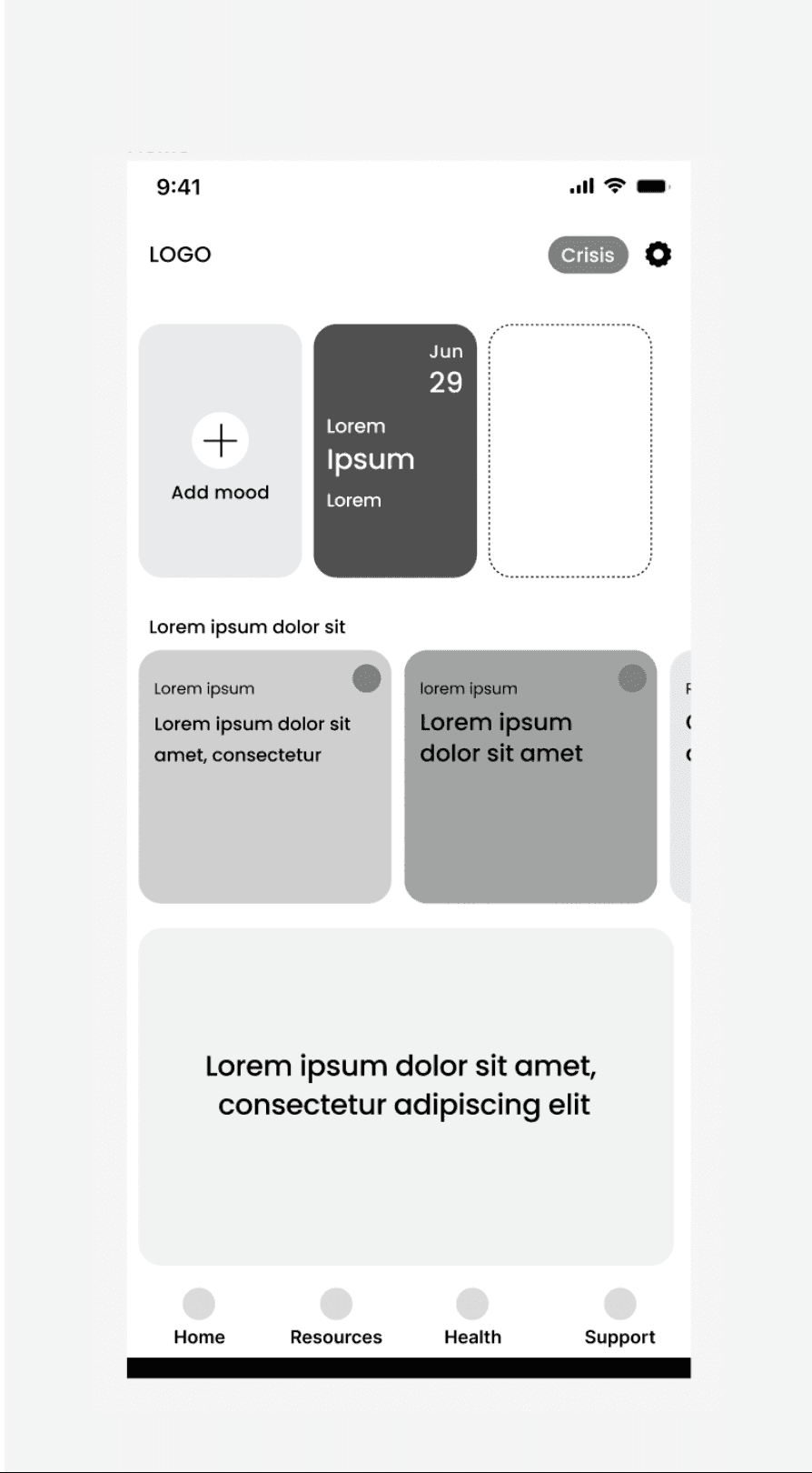
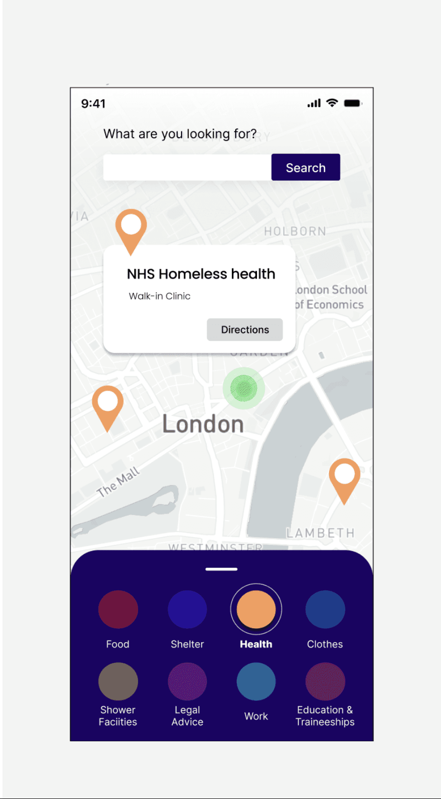
Next, I created the 4 main navigation menu of the app, which featured: Home, Resources, Heath and Support buttons.
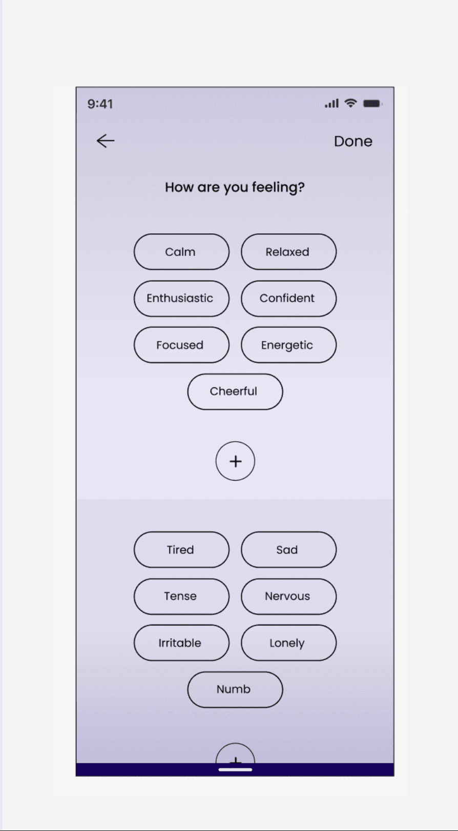
I also looked into easy steps one might take if they’re struggling with mental health. So I added a mood tracker to help understand their behaviour or to shared with health professional
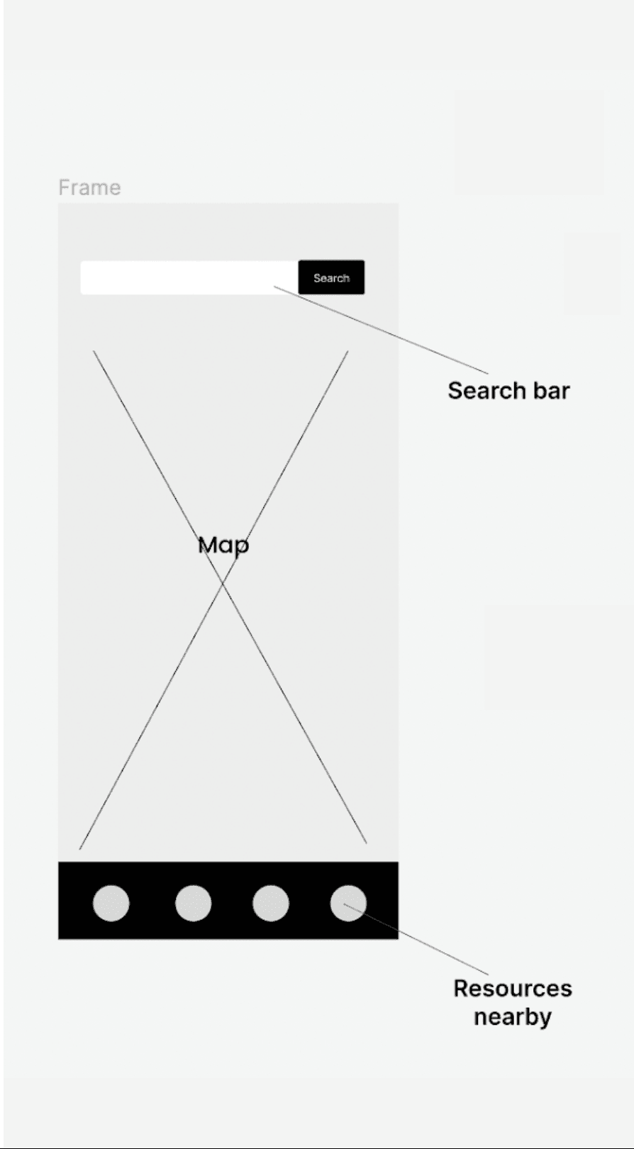
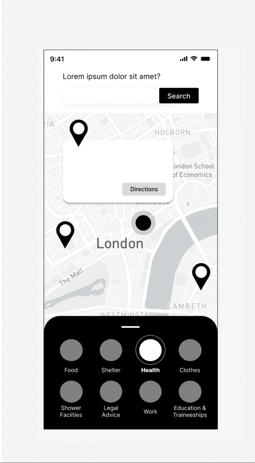
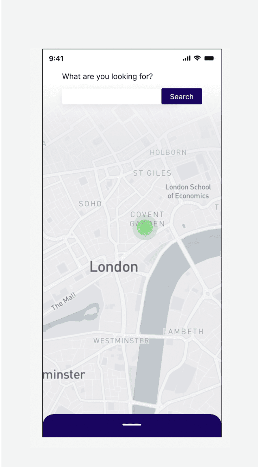
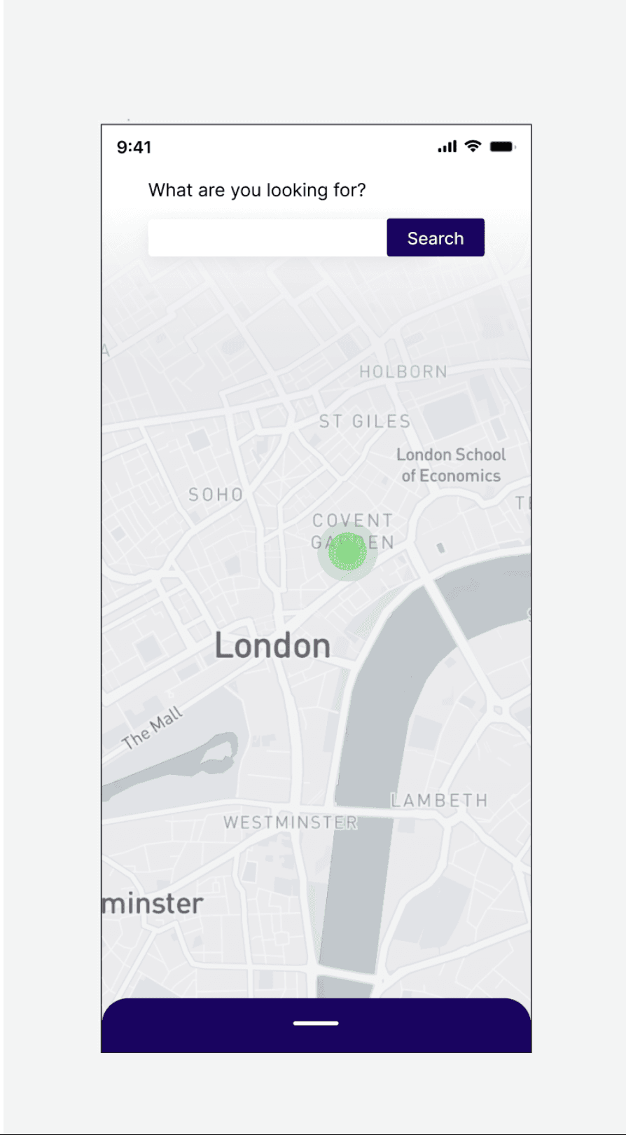
I’ve also further developed the resources map, with location icons, a scroll up directory and a search bar at the top.
High Fidelity Wireframes

Finalised the look and feel of the app. I chose to use light colours as they connote a friendlier tone. I used the lilac in the mood tracker section to bring a sense of calm.
Created a recommendation section that links to articles and videos. To further support anyone who’s struggling.
Extra High Fidelity Wireframe: Map Extension
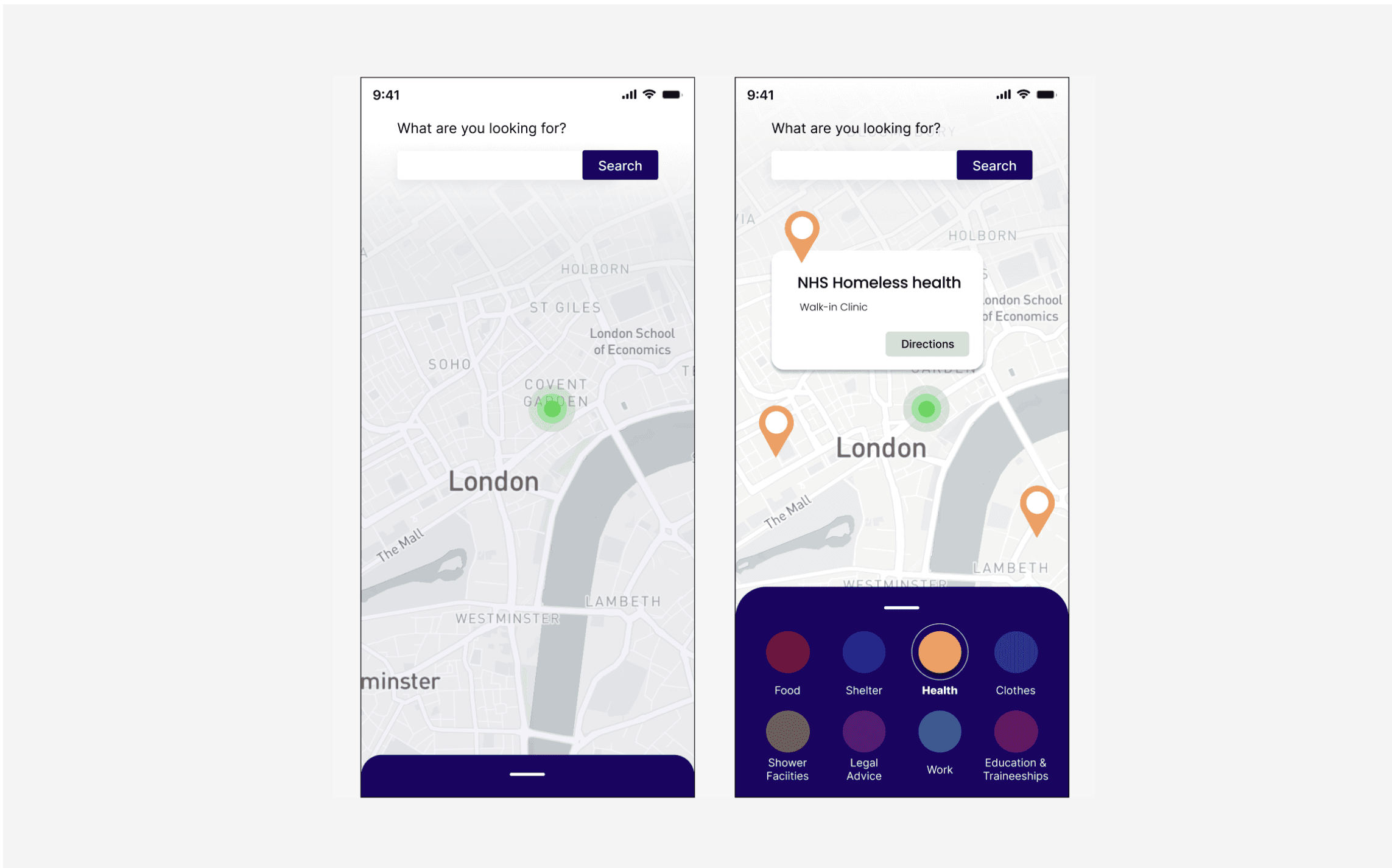
I kept the map to a minimal. Added a light gradient to the top of the map to lessen the distractions and highlight the search bar.
Also made a scroll up feature to show the list of resources.
Following the ideation stage I felt confident to begin wireframing possible solutions to the problem at hand.
Next, I created the 4 main navigation menu of the app, which featured: Home, Resources, Heath and Support buttons.
I also looked into easy steps one might take if they’re struggling with mental health. So I added a mood tracker to help understand their behaviour or to shared with health professional
I’ve also further developed the resources map, with location icons, a scroll up directory and a search bar at the top.
Finalised the look and feel of the app. I chose to use light colours as they connote a friendlier tone. I used the lilac in the mood tracker section to bring a sense of calm.
Created a recommendation section that links to articles and videos. To further support anyone who’s struggling.
Extra High Fidelity Wireframe: Map Extension
I kept the map to a minimal. Added a light gradient to the top of the map to lessen the distractions and highlight the search bar.
Also made a scroll up feature to show the list of resources.
Wireframes
Mid Fidelity Wireframes
High Fidelity Wireframes
-
Finalised the look and feel of the app. I chose to use light colours as they connote a friendlier tone. I used the lilac in the mood tracker section to bring a sense of calm.
Created a recommendation section that links to articles and videos. To further support anyone who’s struggling.
Extra wireframe: Map extension
-
I kept the map to a minimal. Added a light gradient to the top of the map to lessen the distractions and highlight the search bar.
Also made a scroll up feature to show the list of resources.


Design System
I made a Design System for this project as they are essential elements for the design of an app. They make it possible to create an important base for all the elements of an app and to speed up the design phase when in collaboration with other designers.
Style Guide
Brand Logo
I named the app night light, as I wanted it to connote a sense of safety and comfort. Based on my user research, many homeless individuals feel unseen and misunderstood. Giving them an app that lets them control which resources they need might help them take the steps back into society.
Prototype
Website Prototype


Test
Accessibility
I considered how accessible my design is consistently throughout my design process:
WCAG
I tested my design against the contrast requirements, using a plugin on Figma; Contrast to ensure this was adhered to. Colour contrast received an AAA result.
Logical Hierarchy & Information Architecture
Structuring elements and copy on all pages to represent the intended flow of information.
Aesthetic-Usability Effect
Based on the research users often perceive aesthetically pleasing design as design that’s more usable. Unfortunately aesthetics design is not considered in many homeless apps. To support this community I made the app aesthetically pleasing using minimal icons and light colours that connote to a calmer friendlier tones.
Consistency
I wanted to ensure that buttons had the same curvature, paragraph structure remained the same and the colour scheme matched across App.
Text Size
Ensuring all text sizes are 13 points and above.
Law of Common Region
I separated elements by using a lot of white space in between items or by using coloured sections throughout the app. This clearly helped define boundaries and put elements into sections
Overview & Reflections
Based on my user research, many homeless individuals feel unseen and misunderstood. Giving them an app that lets them control which resources they need might help them take the steps back into society.
A toolkit was needed to bridge the gap between the homeless community and resources that are available to them. I created night light to provide access to mental health services as well as being aware of local resources they might need.
If I was to complete this app, I would have had more first hand user research and also further developed the lifestyle quiz with mental health professionals.
I had a chance to reflect during the creation of the app and it became a truly meaningful design process and an interesting problem to solve.
Website Prototype

Website Prototype
Mobile Prototype
Mobile Prototype